Let’s create your beautiful Instagram feed, that you love and that your clients love too.
Here are 15 Instagram feed ideas for interior designers, architects, builders and home decor lovers.
Let’s get straight into it!
Feed idea #1. Color Theme
Let’s start simple and beautiful:
Choose one or more of these:
- A color theme (your brand theme)
- A color palette, or
- Use the same filter on all your photos and videos.
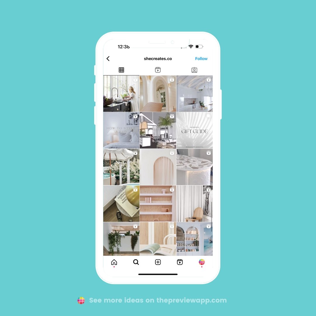
This will make your entire feed look cohesive, like @shecreates.co:
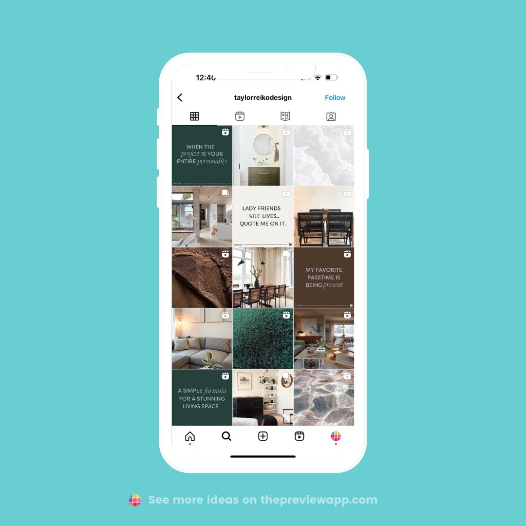
Feed idea #2. Giant moodboard
Next idea: You might not want to show pictures of your work only.
You can share photos of textures that reflect your style, or the style of a project you are currently working on.
Basically, your entire feed looks like an amazing moodboard.
Like @taylorreikodesign:
Feed idea #3. Rows
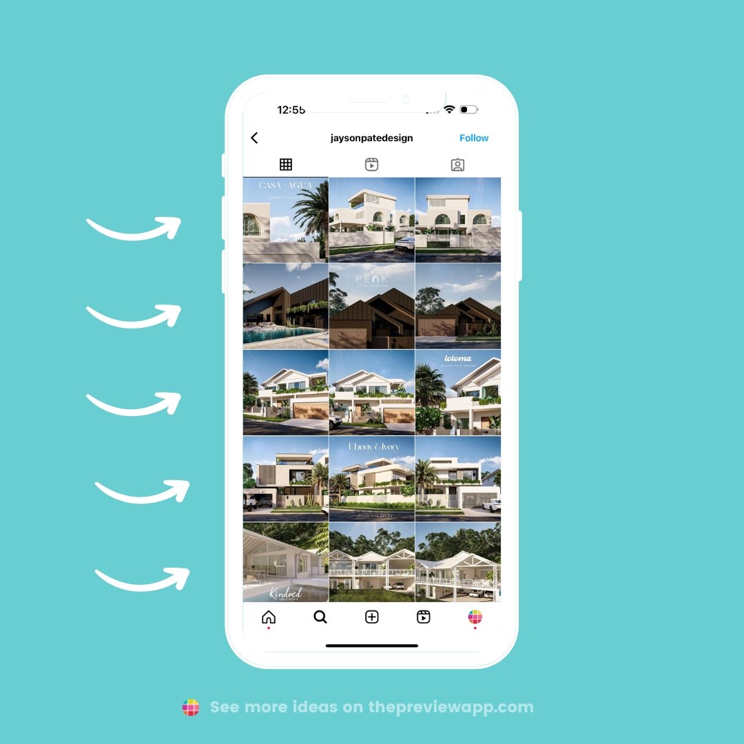
Want to get creative? Think of your grid as having rows. Each row can have its own theme, project or color.
For example, @jaysonpatedesign highlights one project per row:
Tip: Join 15 Million Instagrammers. You can move your posts and plan your feed with Preview App.
Feed idea #4. Columns
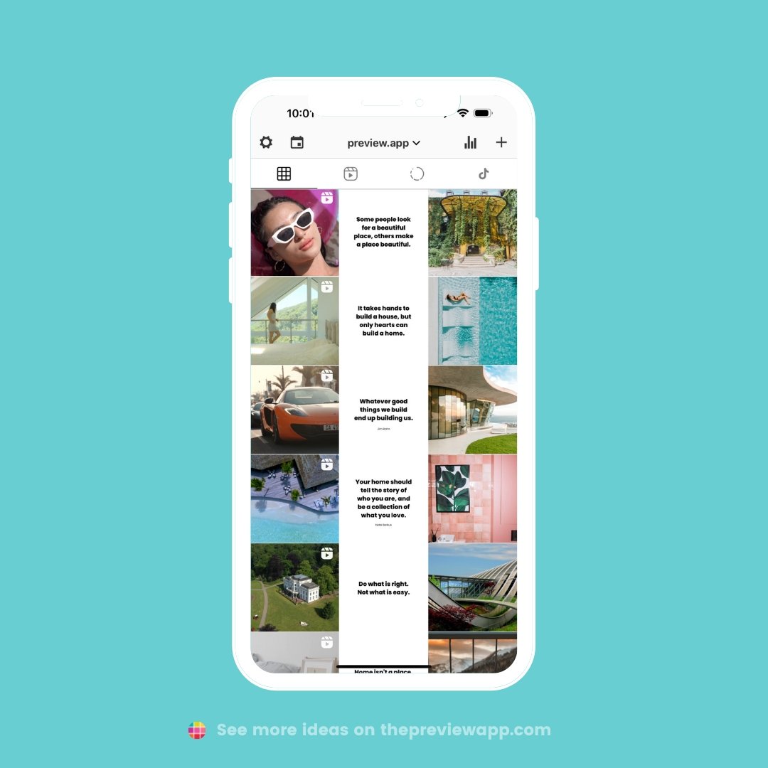
Think of your feed as having 3 columns. Each column can have its own theme.
For example:
- Left column: Videos only
- Middle column: Quotes only
- Right column: Photos only
You choose what you want to post in each column, to create your own unique grid.
Feed idea #5. Tiles
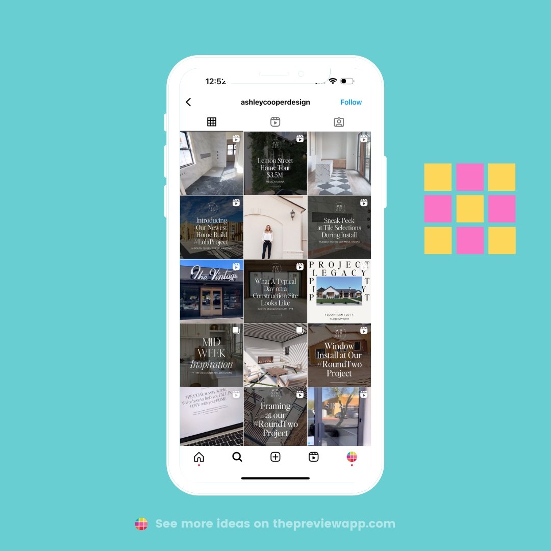
Alternate between 2 different types of posts.
For example:
- Photos vs videos
- Quotes vs photos
- Different color photos (e.g. black and white vs color)
- Anything you can think of
It will create a tiles feed layout like @ashleycooperdesign:
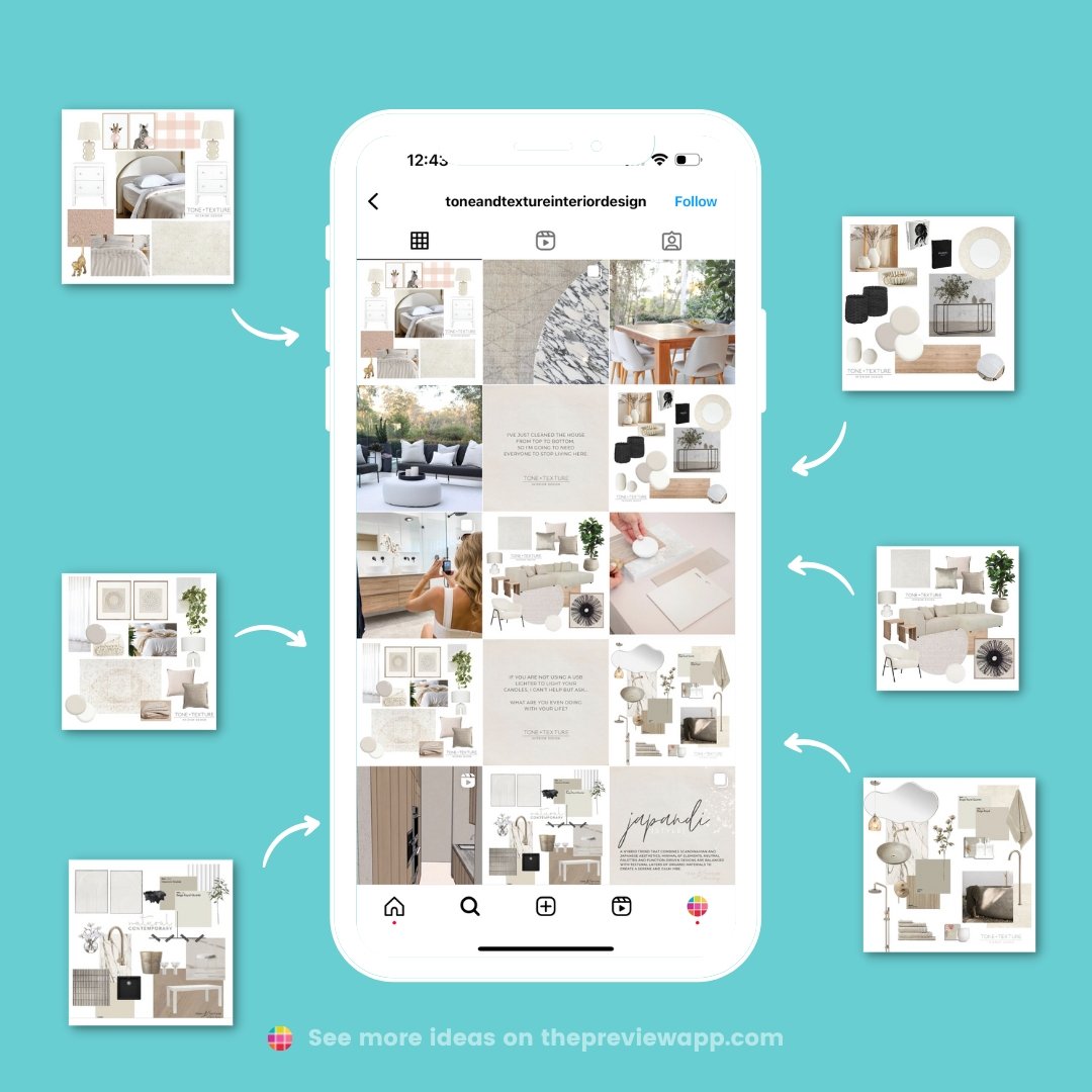
Feed idea #6. Vision boards
Love creating vision boards with furniture, tiles, textures, home decor?
Make it your theme, like @toneandtextureinteriordesign:
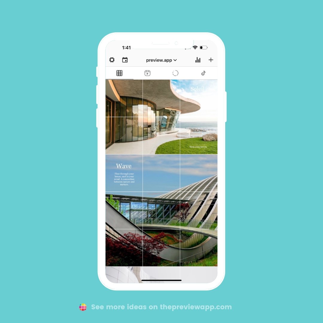
Feed idea #7. Puzzle
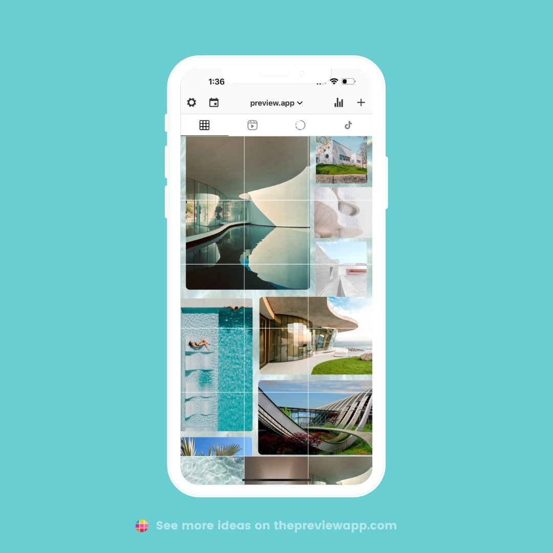
Split a big image into individual posts. The opportunities are endless.
Here are just 2 Puzzle Feeds I have created using Preview App, to give you an idea:
Feed idea #8. Rainbow
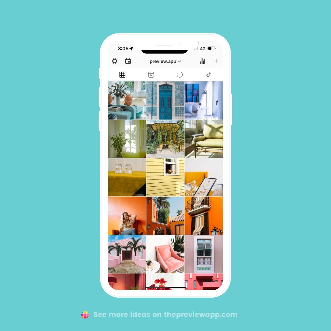
Do you take photos of colorful things?
Could you organize your content by color?
If so, a Rainbow Feed would be perfect for you.
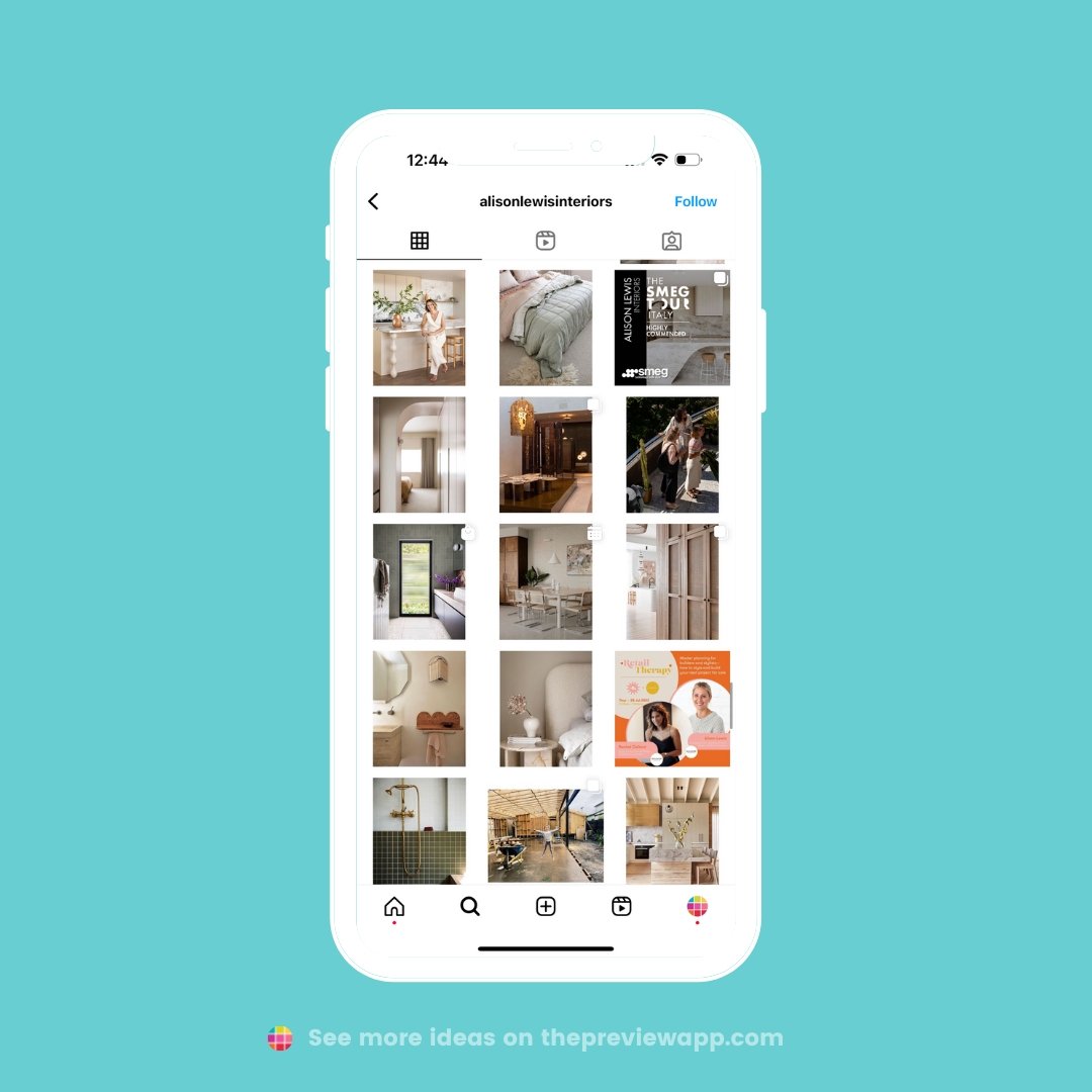
Feed idea #9. Borders
Add a white border (or any other colored border you want) around your posts.
It will make your feed look like an art gallery.
Like @alisonlewisinteriors:
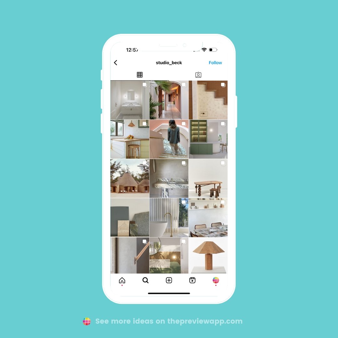
Feed idea #10. Mix of work and inspiration
Are you finding interior or architecture inspiration from other sources?
Why not post them on your feed too, along side your own work?
This way your feed feels like an extension of your style.
Like @studio_beck:
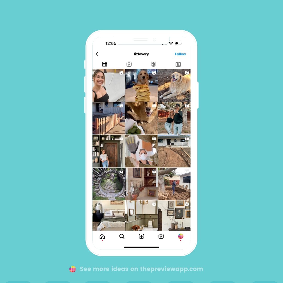
Feed idea #11. Personal
Feel like posting more than just interior design, architecture or home decor?
Feel free to post about your personal life if you want to (show your dogs, behind the scenes, food, or anything else you want to share).
Like @lizlovery:
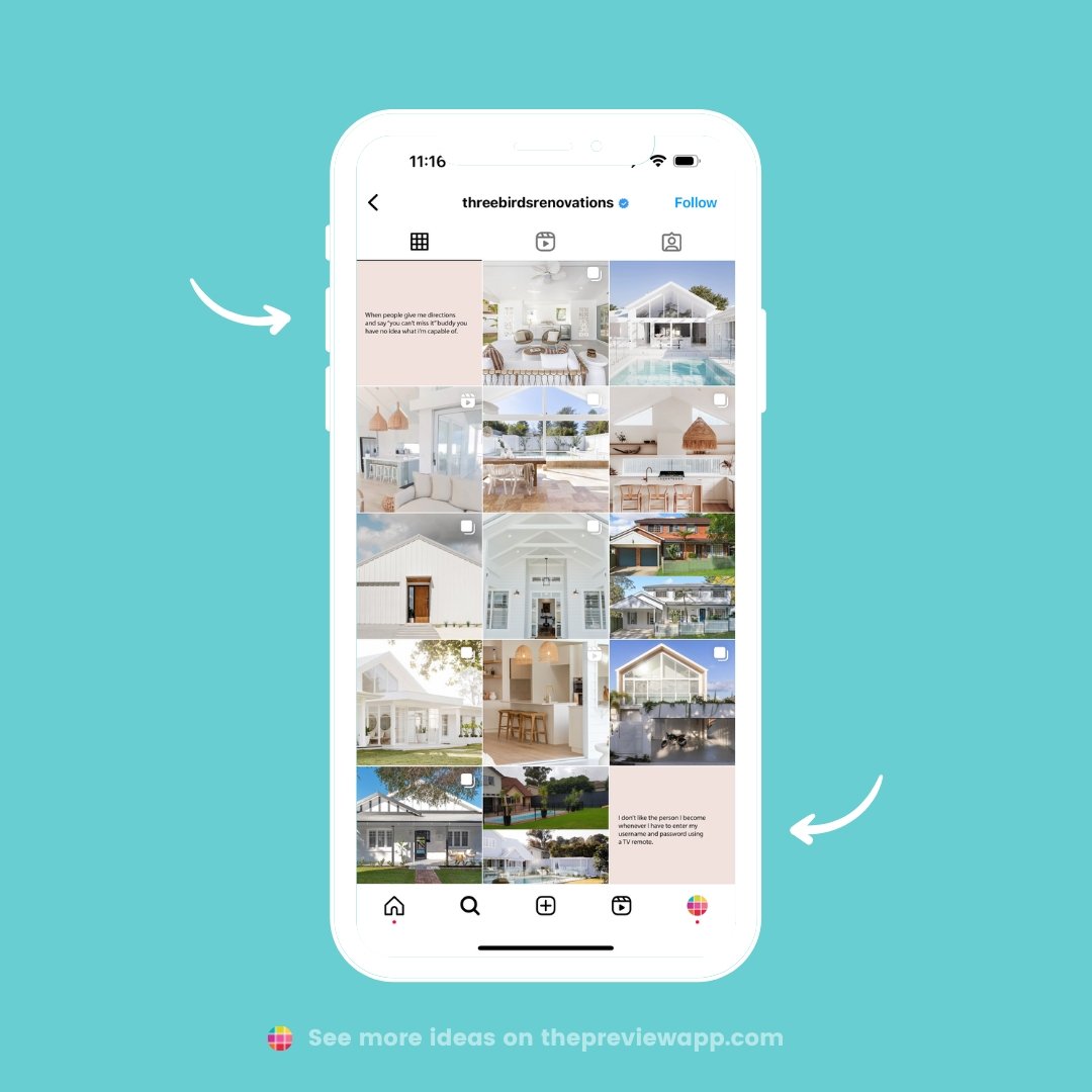
Feed idea #12. Relatable quotes
You can share an inspirational or funny quote, depending on what your brand / personality is.
For example, @threebirdsrenovation always share funny quotes related to home and family life. And their audience LOVE it!
Feed idea #13. Reels only
Want to produce only one type of content? Like Reels?
You can repurpose your Reels and post them on TikTok and Facebook too.
Like @the_real_house_of_ig:
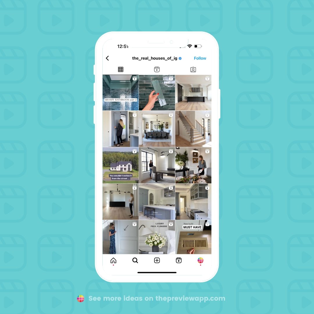
Tip: Schedule your Reels to post on Instagram, Facebook and TikTok with Preview App.
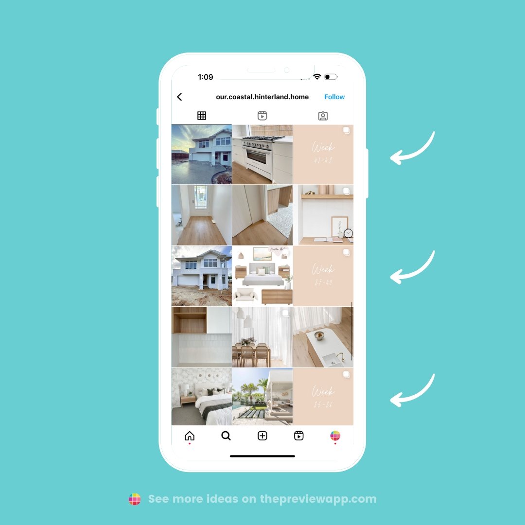
Feed idea #14. Progress carousels
Share weekly progress pictures or videos. It can be progress of a new home build, renovation or interior design.
Feed idea #15. Tips
Do you have a lot of tips to share?
People following experts and getting new tips, tricks and hacks.
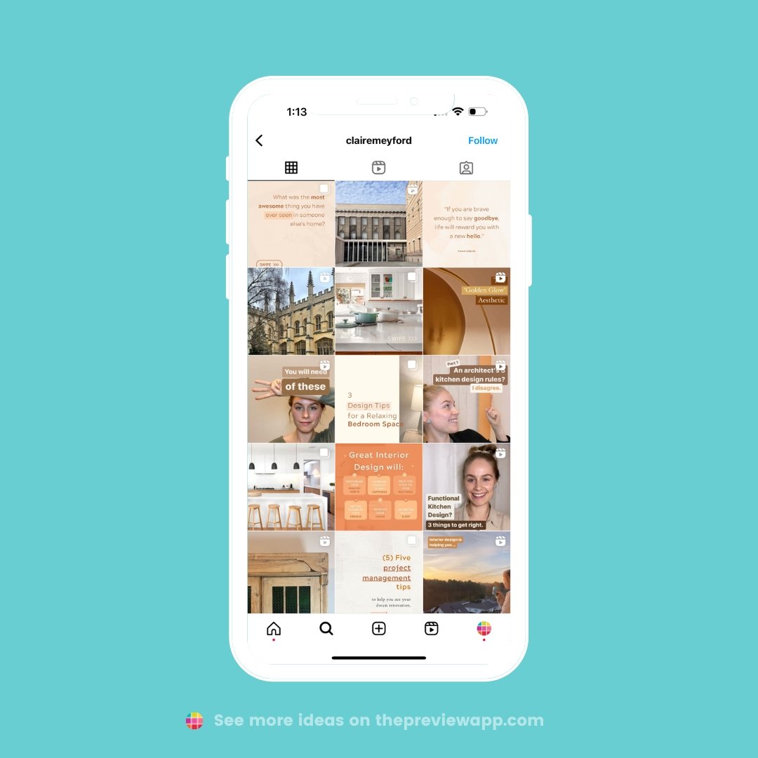
@clairemeyford is great at it:
