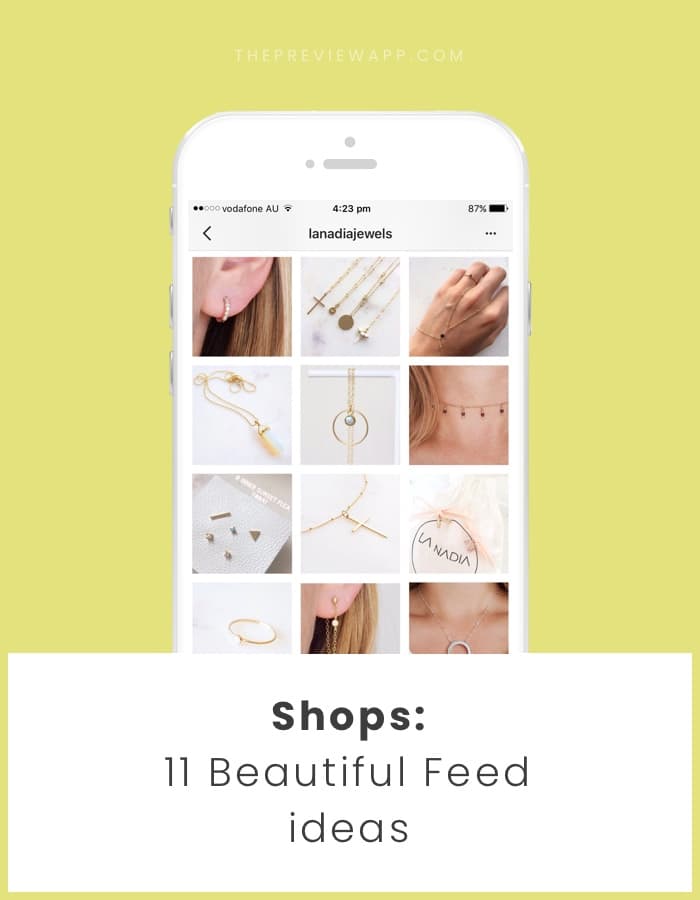
I’m going to show you 11 awesome Instagram feed ideas for your shop. As I always say: “Take your Instagram page seriously so your customers take YOU seriously.”
The look of your feed is super important to make a good first impression (that’s how you get your customers hooked). That’s also how you create brand awareness and recognition.
If you love to visualize and design your feed before you post on Instagram, use Preview app. It will help you rearrange the order of your posts and edit your photos (and plan your hashtags, see your analytics, etc…).
Are you ready? Let’s start!
Here are 11 Instagram feed ideas you can try right now:
- Monotheme
- Lifestyle feed
- Color coordination
- Background perfection
- Flatlay
- Tiles feed
- Line in the middle feed
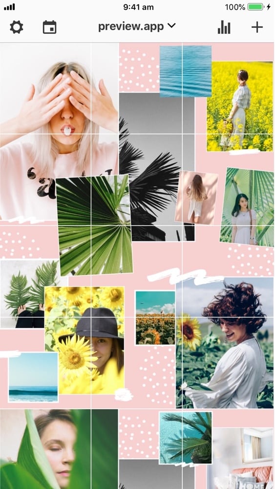
- Puzzle feed
- White border
- Drawings
- Rainbow feed
1. The monotheme
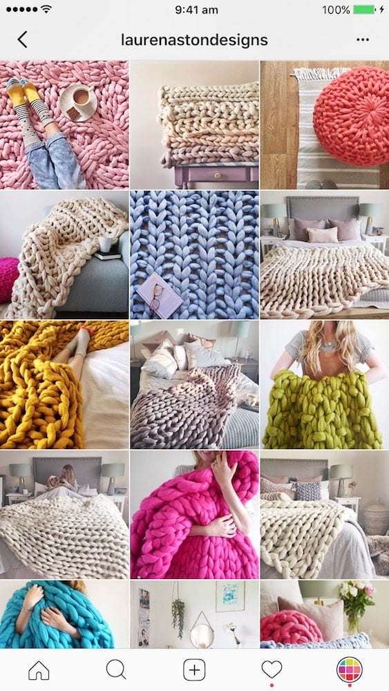
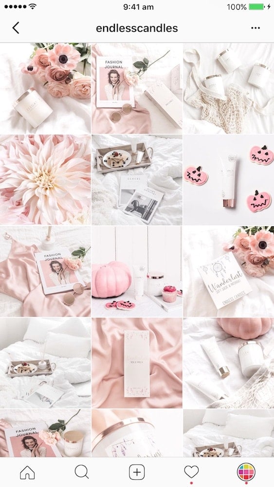
A monotheme is when you only post photos of one thing: your products.
Usually, the photos are a close-ups of products. It the the most popular Instagram feed for shops.
The key is to be very creative with the photos.
Here are some examples:
- @laurenastondesigns and her chunky knitted blankets
- @endlesscandles shares photos of their candles and body products
2. Lifestyle feed
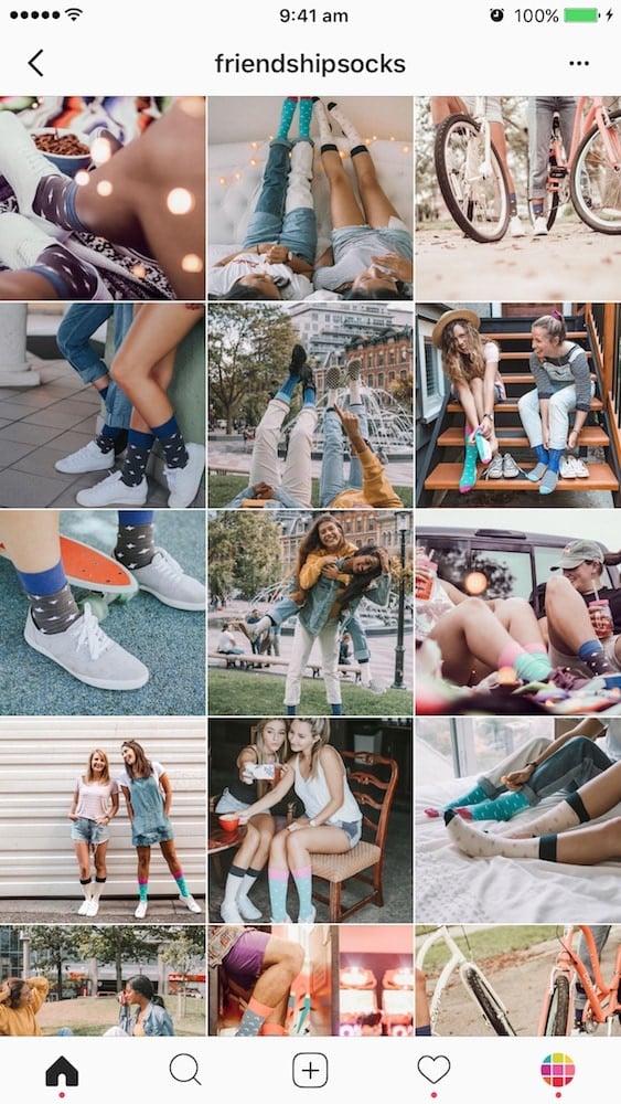
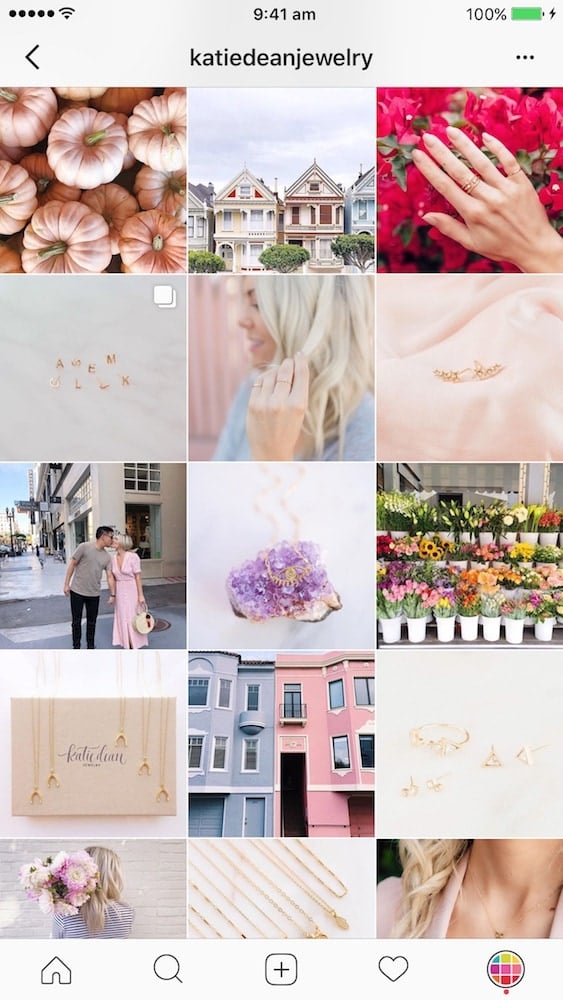
You can also post photos other than your products only. This will make your feed more like a “lifestyle” feed.
The trick is to create a “lifestyle” around your products. Share photos that are related to your products.
An example is selling bikinis and sharing photos of the beach, palm trees and sunsets.
Here are other examples:
- @friendshipsocks: Just like socks come in pair, so do friends. Friendship Socks are all about friendship and fun.
- @katiedeanjewelry: Katie shows photos of her jewelry and also lifestyle photos like flowers and building.
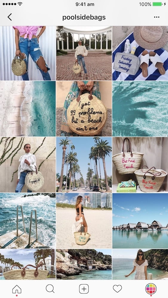
- @poolsidebags: Pool Side Bags is all about spreading those vacation vibes – whether you’re by the pool or at the beach. They show you how you can pair their beautiful bags with your outfits. They also share dreamy photos of the beach.
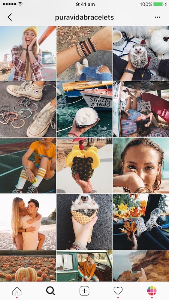
- @puravidabracelets: Pura Vida Bracelet is not just a bracelet. It represents adventure and living life. The photos show that lifestyle.
3. Color coordination
Many Instagram shops stick to a color palette for their feed. Colors are part of their brand and create the whole vibes of their feed.
If you want to color coordinate your feed, choose 2 – 5 colors that go well together and stick to them. That’s your color palette.
You can also choose your color palette based on the colors of your products.
Here are some awesome examples of Instagram shops sticking to a color palette:
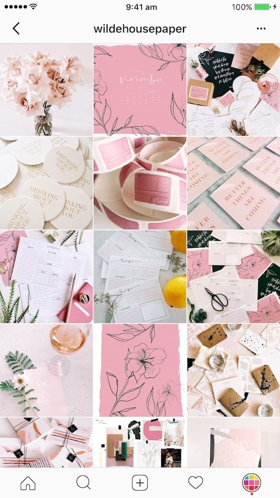
- @wildehousepaper: Pink and white are the main colors. Then there are pops of green (plants) and black (stationery).
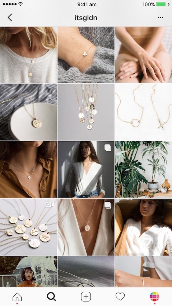
- @itsgldn: White, grey, brown (skin) are the main colors. There are pops of green (plants) and black (clothes).
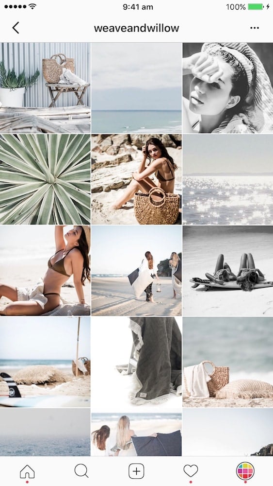
- @weaveandwillow: Blue, green, brown, black and white.
If you take photos of a lot of different colorful things, it’s okay. You can still make your feed look professional by paying attention to the background of your photos.
4. Background perfection
I always say it: the background of your photo is crucial.
If you can, stick to 1 – 5 different backgrounds for your photos.
When you take a photo, pay attention to your background:
- It needs to be clean, or
- It needs to give context to your photo
You want people to see your products. You don’t want your background to distract people.
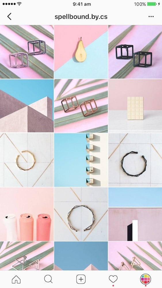
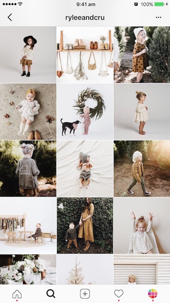
Here are examples of Instagram shops who keep consistent backgrounds:
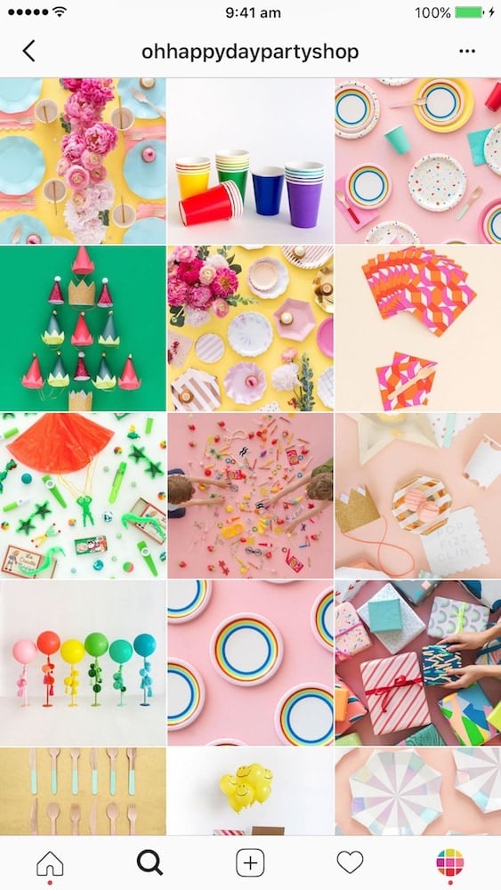
- @ohhappydaypartyshop: solid background color (usually pastel)
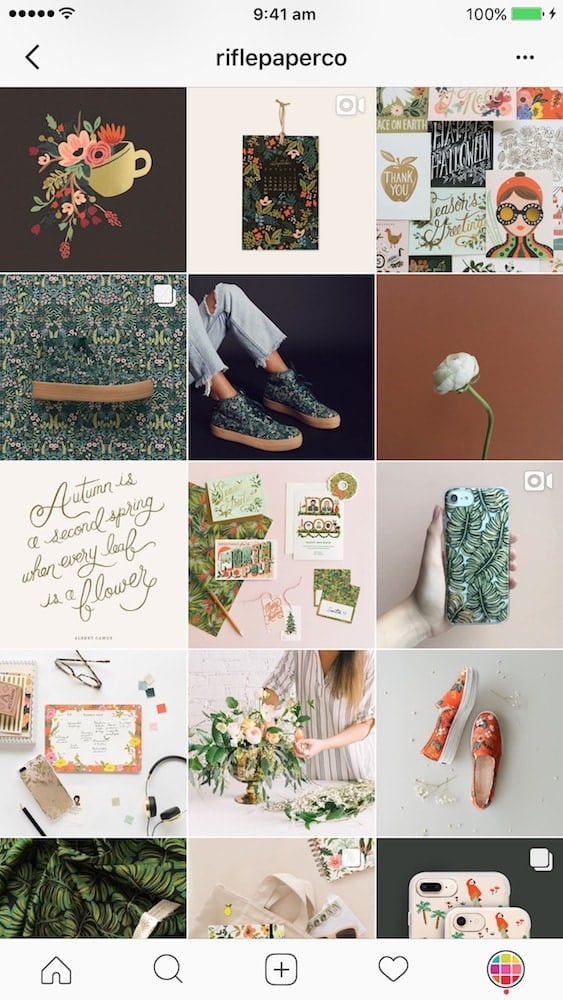
- @riflepaperco: white, brown, black are the main colors
- @endlesscandles: white background
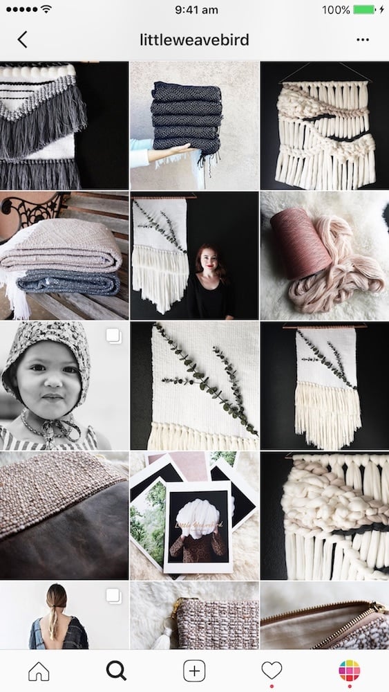
- @littleweavebird: black and white
- @spellbound.by.cs: pastel geometric shapes background to fit with the geometric shaped jewelry
- @ryleeandcru: white and green (nature) are the main colors for clean, earthy vibes

5. Flatlay
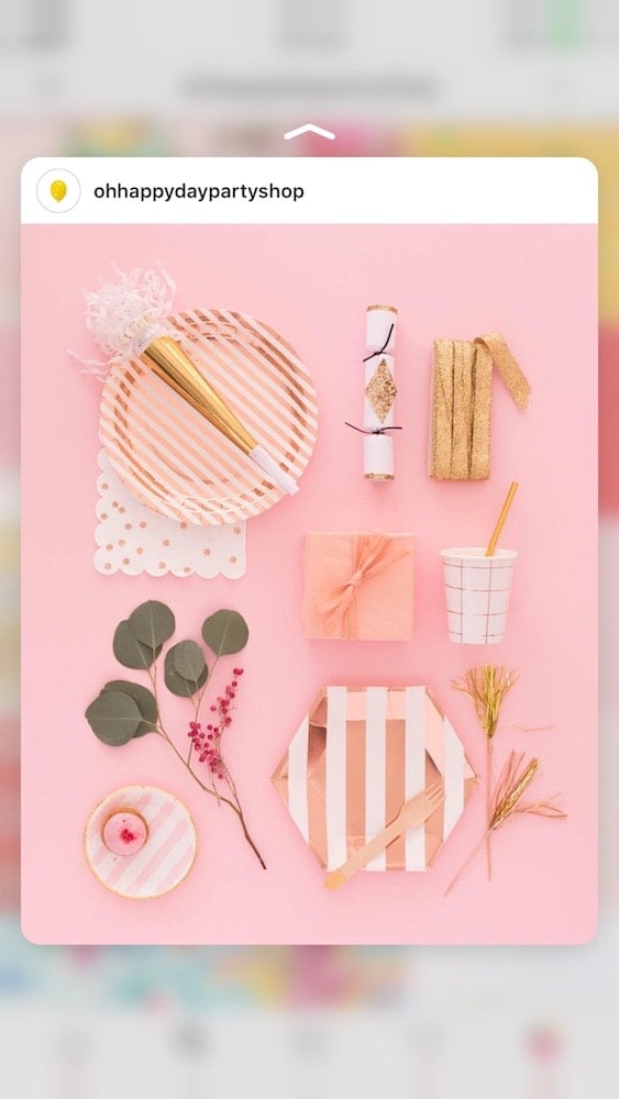
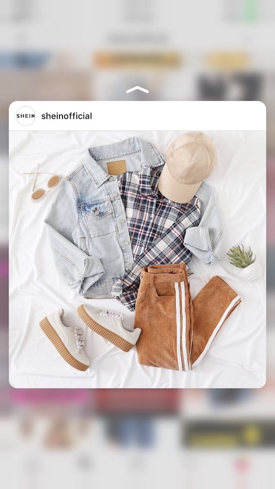
In case you don’t know what a flatlay is: A flatlay is a type of photo where you lay the items flat on a surface (floor, bed, table) and style them in a creative way.
The whole feed for your shop can be flatlays only.
Flatlays are a great way to show your product as the king of the photo. The other items can be styled around it. They can give context to your product.
Here are some great examples:
- @ohhappydaypartyshop: almost everything is a flatlay
- @sheinofficial: Shein’s page is a great example for fashion Instagram feeds. They don’t share flatlays all the time, but when they do flatlay photos get more likes than the other photos. Quick note: Their flatlay photos are always on a white background.
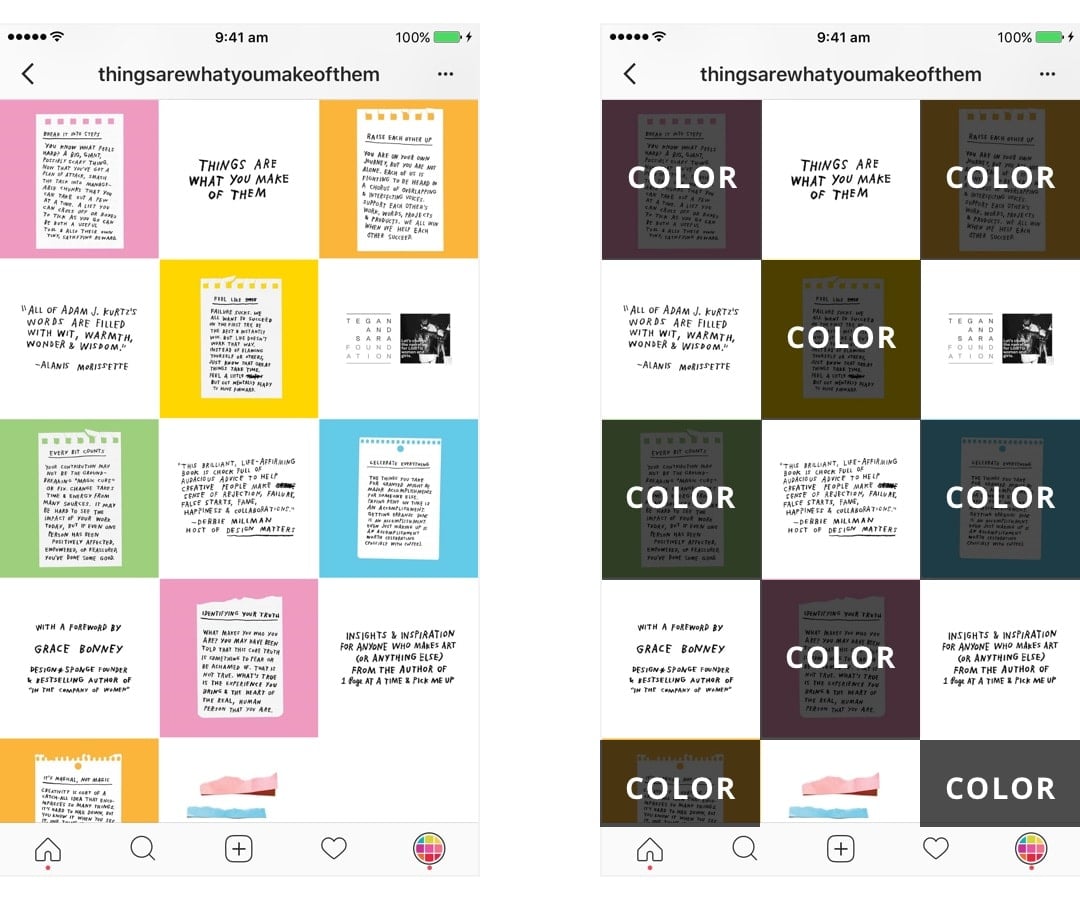
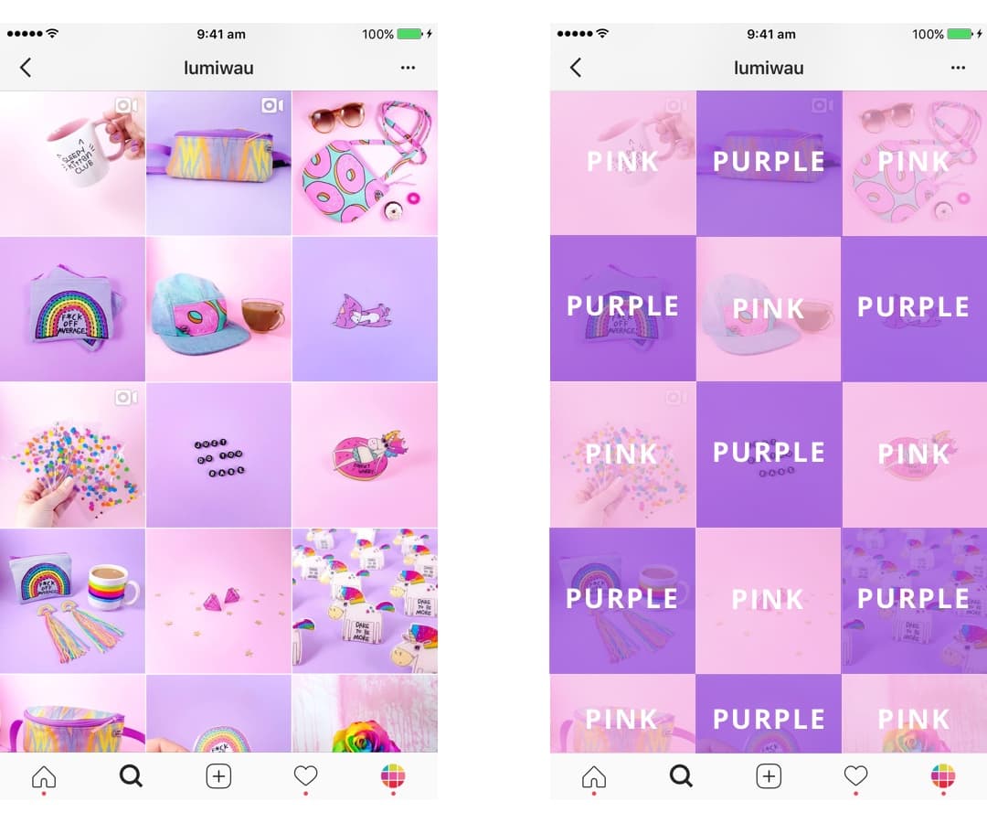
6. Tiles feed
This is is another cool Instagram feed idea for your shop. Design your feed like tiles.
The trick is to alternate between a photo and a quote.
It doesn’t need to be a quote only. It can be:
- Tips for your customers
- Facts about your products
- A different type of photo (with a different background color for example)
Be as creative as you want.
Here are some examples:
- @thingsarewhatyoumakeofthem: Adam alternates between a quote with white background and a colorful image
- @lumiwau: Lumi alternates between pink and purple backgrounds
7. Line in the middle
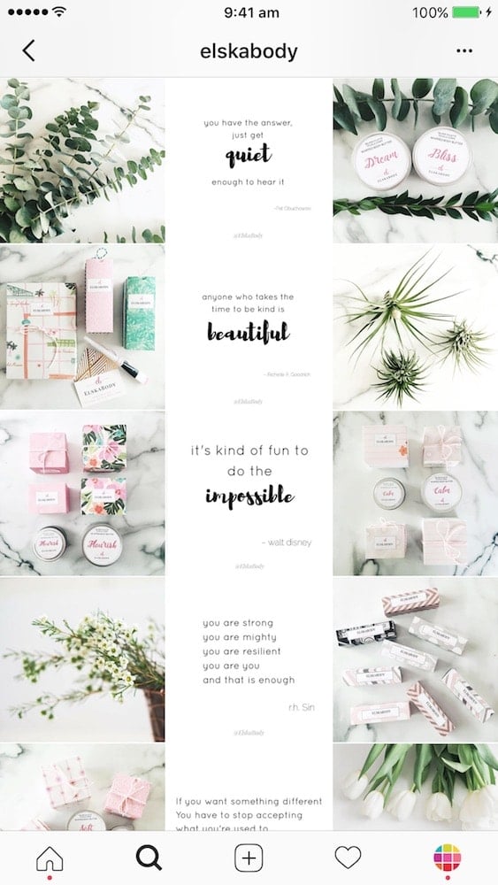
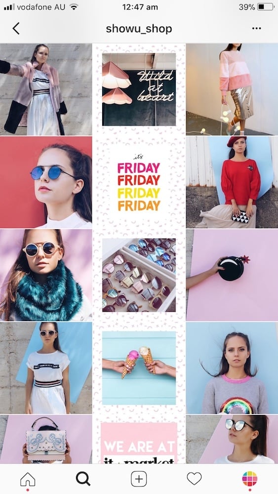
This is another unique Instagram feed idea for your shop! The line in the middle is awesome because it makes you want to scroll and scroll and scroll – which is great for you because it keeps your customers longer on your page.
Tutorial: How to Make an Instagram Feed with a Line in the Middle using Preview app
Usually, people share quotes on a white background in the middle. But you can be as creative as you want. Your line in the middle can be anything.
Here are awesome examples:
- @elskabody uses the line in the middle to share quotes
- @romewe_us uses the line in the middle for flatlays of outfits only
- @showu_shop uses the line to show photos against a fun background
8. Puzzle feed
This is a “next level” Instagram feed idea. It is harder to make and requires more planning. However if you can make it work, you’ll definitely stand out.
You can search for apps on the App Stores that split photos into grids.
If you want to design a unique grid with text, drawings and photos you will need to use Photoshop to split your photos.
Watch this tutorial: How to Split Photos to Make an Instagram Grid?
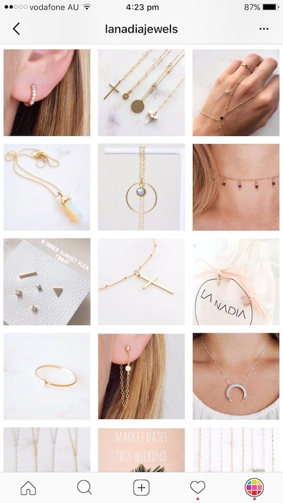
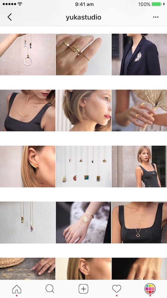
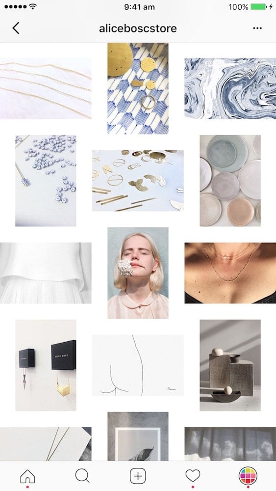
9. White border
White borders allow your feed to “breathe”. There is more space between the photos. It means that it is easier for people to scroll through your feed and see your products.
This feed idea is really good if you are reposting photos of your customers. Often times, when we repost photos they are all different colors, styles and with different filters. A white border is a good solution to keep your feed looking professional.
Favorite white borders in Preview app: “Aura”, “Vela” and “Sole”.
Here are examples of Instagram shops using white borders:
10. Drawings
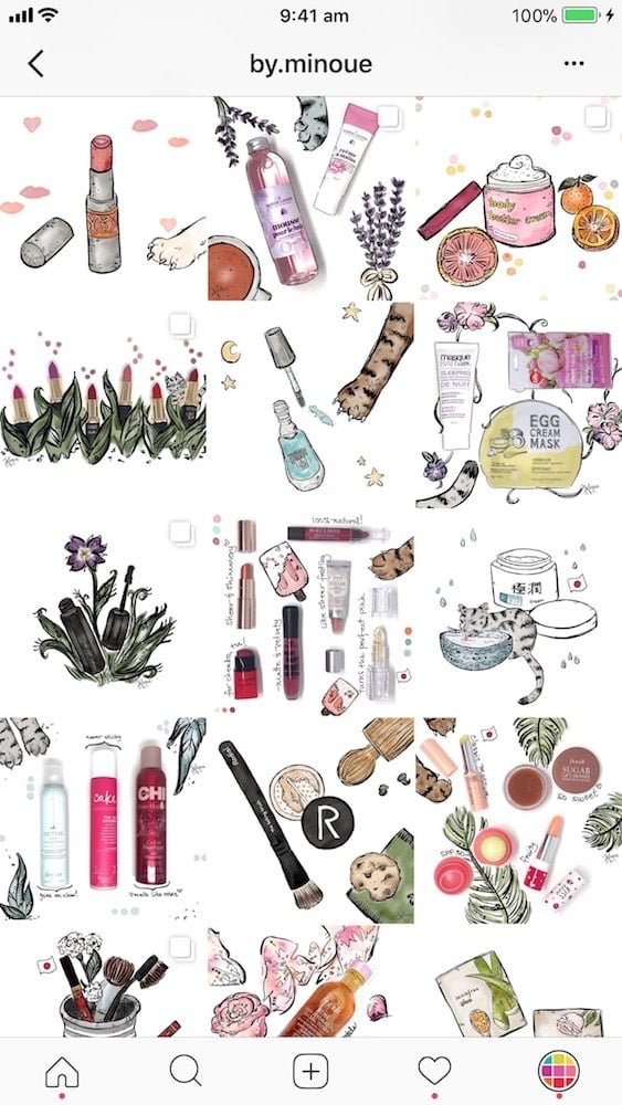
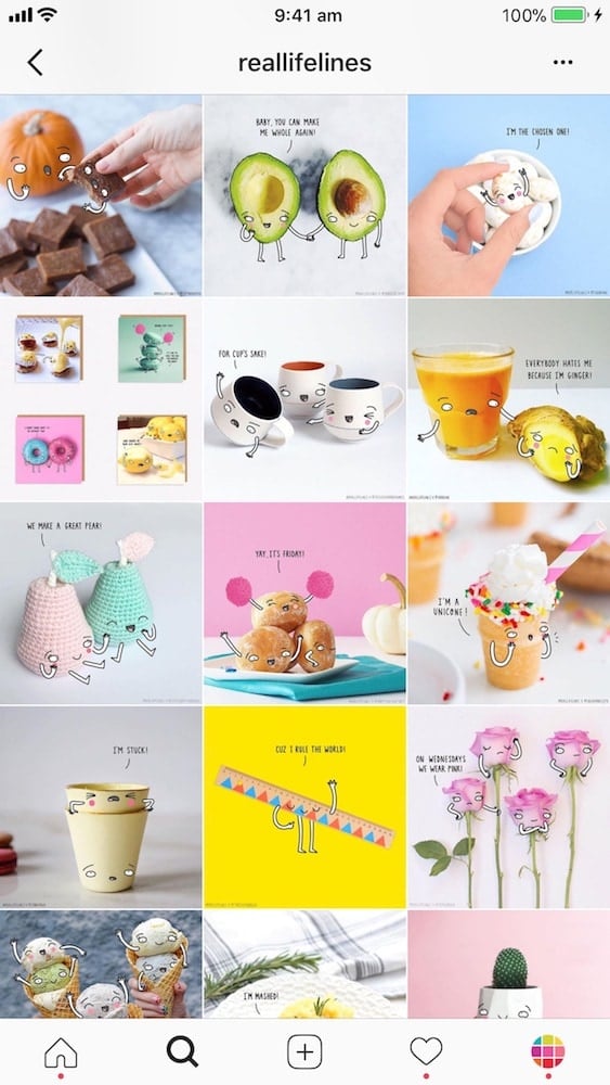
This is a very creative way to catch the attention of people when they are scrolling on Instagram.
Think about it: everything is either a photo or a video on Instagram. You will definitely stop people in their track when they see a photo mixed with drawings. The image is unique and eye-catching.
I haven’t found an Instagram shop that uses drawings all the time to promote their products. But I did find @by.minoue and @reallifelines. Look how fun they make products look!
Don’t you just want to scroll more and discover more posts?
You will definitely creative brand awareness and recognition with an Instagram feed like this!
11. Rainbow feed
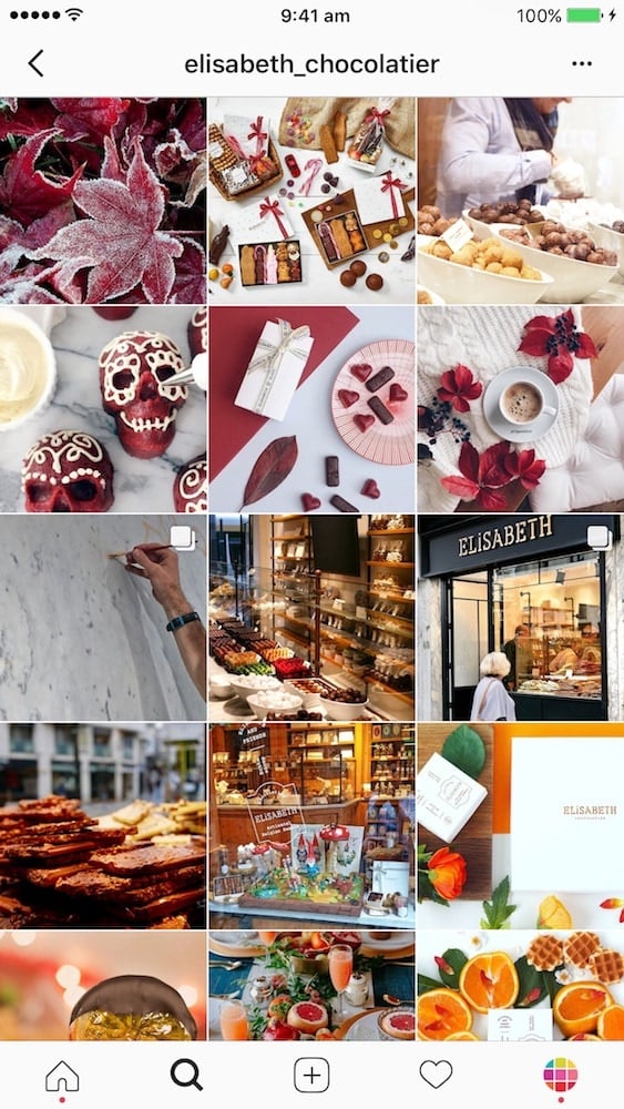
The last Instagram feed idea is to create a rainbow feed. A rainbow feed is when the colors of your photos change when we scroll down. Like a rainbow.
Think about it this way: in a physical shops, the shop manager sorts products (usually clothes, nail polish, stationaries) based on colors. You can do the same for your Instagram feed!
This type of Instagram feed requires more planning, but it is beautiful to scroll through it. You will definitely captivate the attention of people.
Here is an example of Elisabeth Chocolatier @elisabeth_chocolatier, a chocolate shop in Belgium:
I hope this blog post was useful and gave you lots of ideas. Let me know if you have any questions.
Take your time to design your feed. And please… don’t forget to have fun!
Until next time, see you all on Instagram for more Instagram tips and tricks!
+400,000 Instagrammers are already using Preview App to edit, plan & schedule their feed. If you haven't tried it, you're missing out.

