Think of Instagram as a magazine. People arrive on your feed and see your whole layout.
BOOM!
If they are impressed. They will follow you.
How to impress? By sticking to an Instagram grid layout.
Let me explain:
Each square plays an important role in your overall Instagram feed.
You can create different Instagram layouts by planning each square.
Basically: A grid layout = a template = an amazing Instagram theme.
I am going to show you 9 types of Instagram grid layouts.
Want to try to create your own layout right now?
You can use Preview app to create your Instagram grid layout.
With Preview, you can move your posts around to create the feed layout you want.
Ready?
Let’s do this!
PS: Shout out to our amazing community! Most of the feed examples you will see below are created using Preview App.
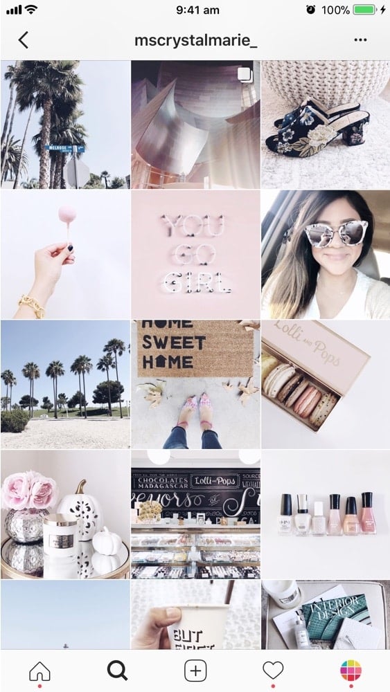
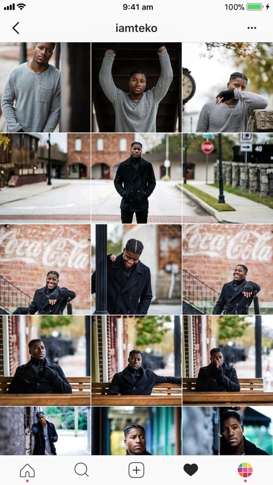
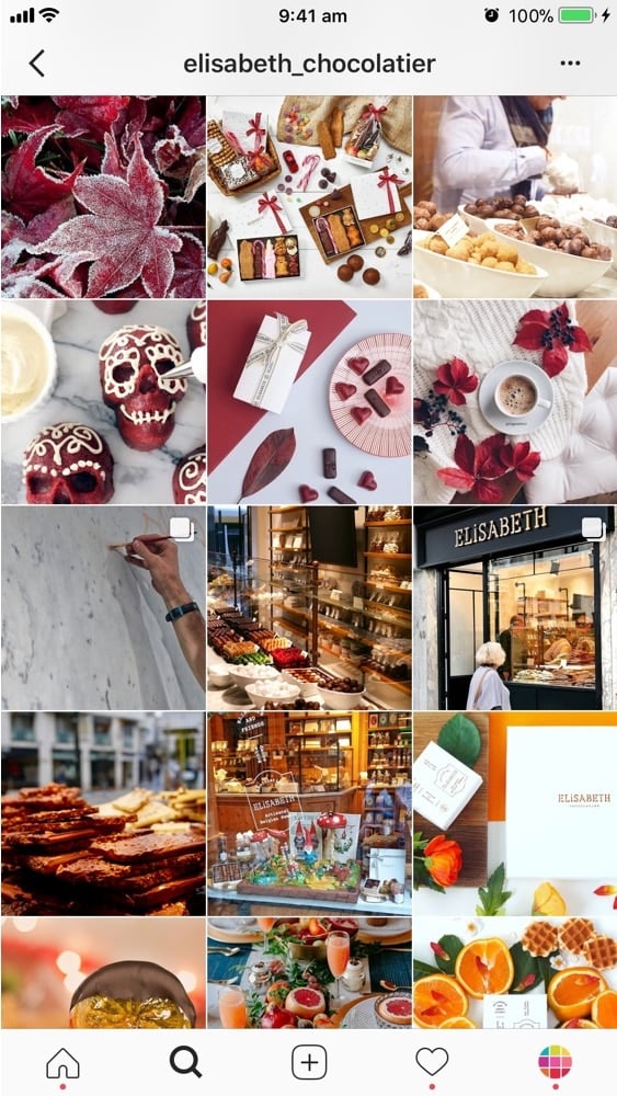
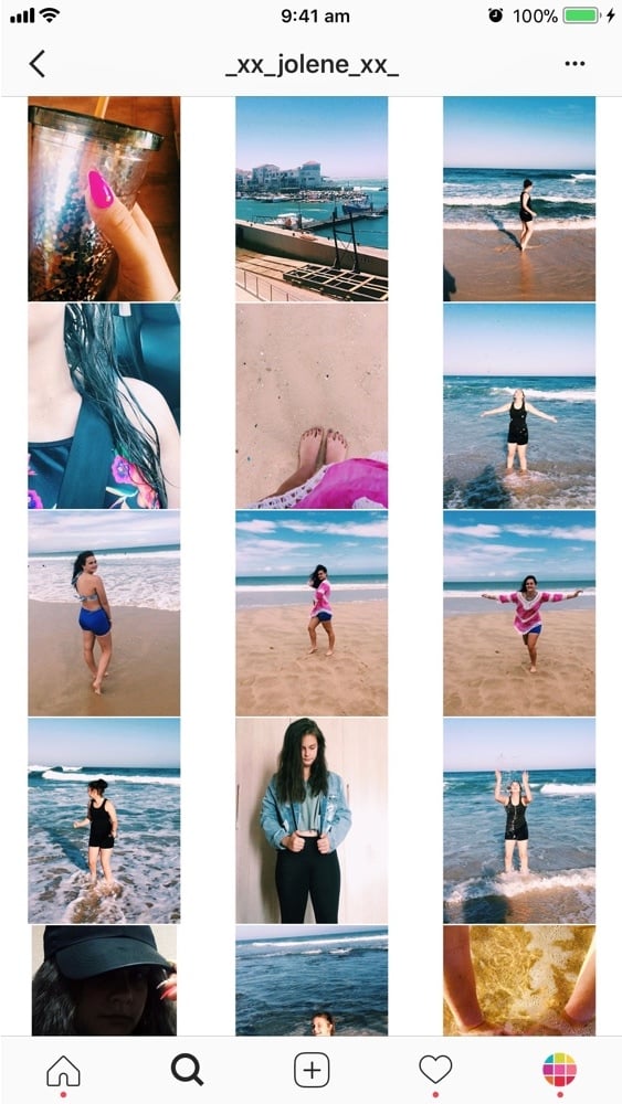
Instagram Grid Layout #1. Squares
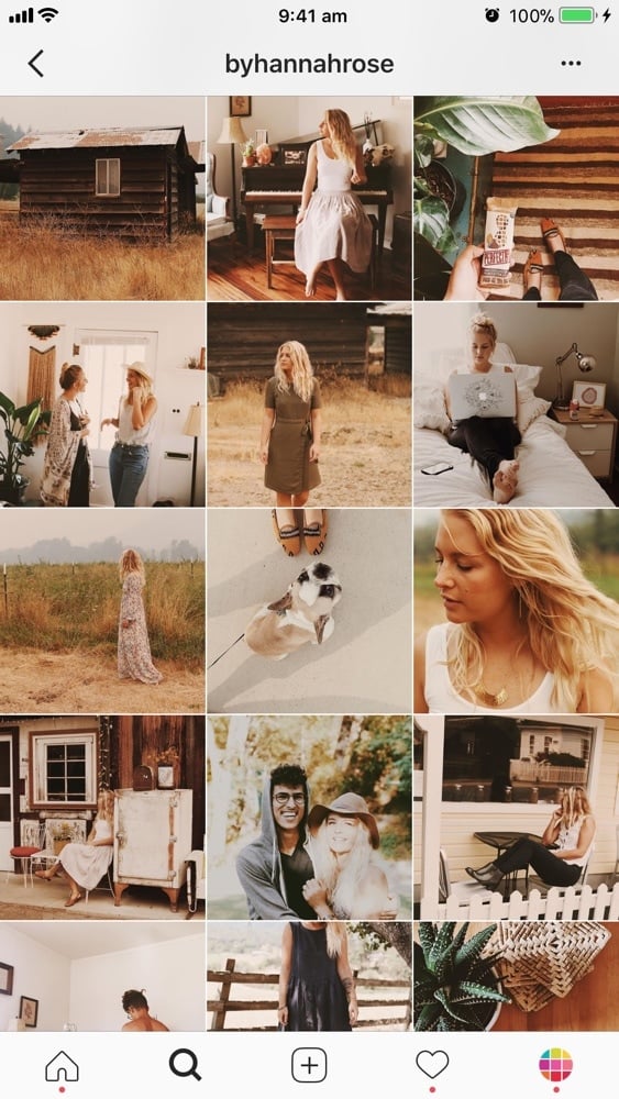
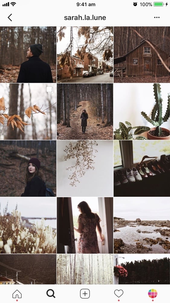
Let’s start easy. The first grid layout is to keep it simple.
Just post your photo, each square at a time. You don’t have to stress out about your whole layout as such, as long as you stick to the same filter and color combination.
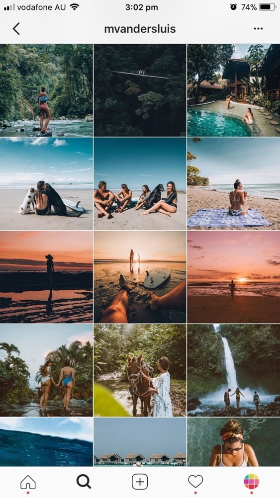
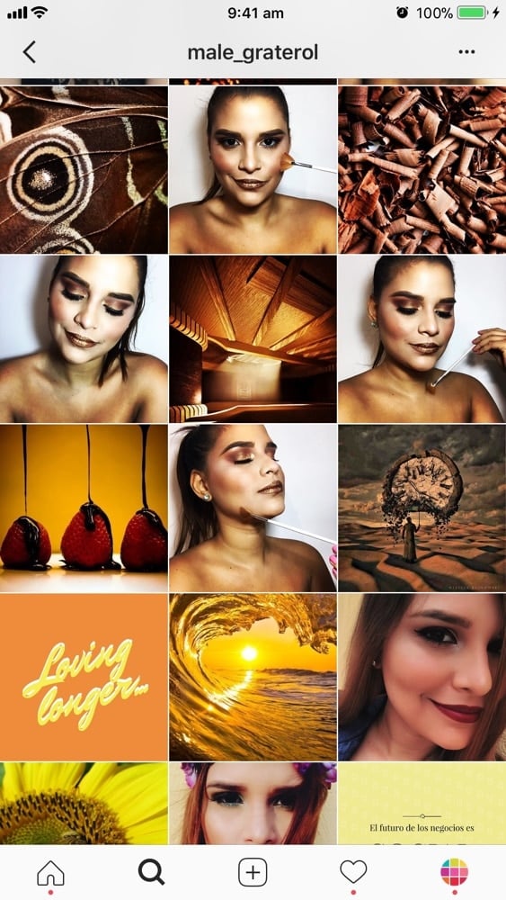
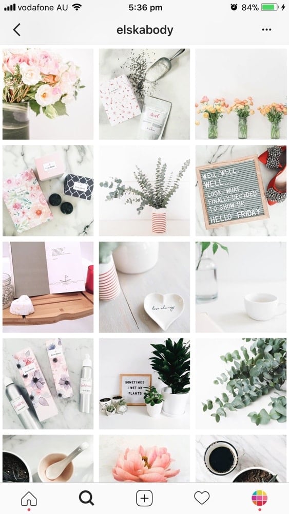
Instagram Grid Layout #2. Diagonal
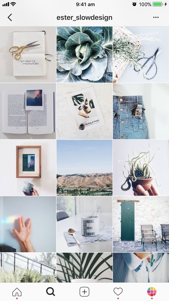
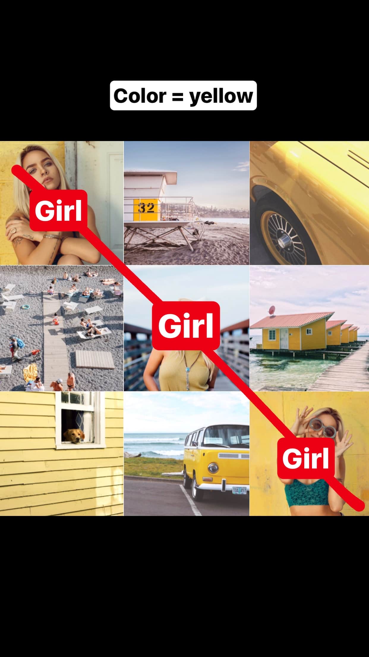
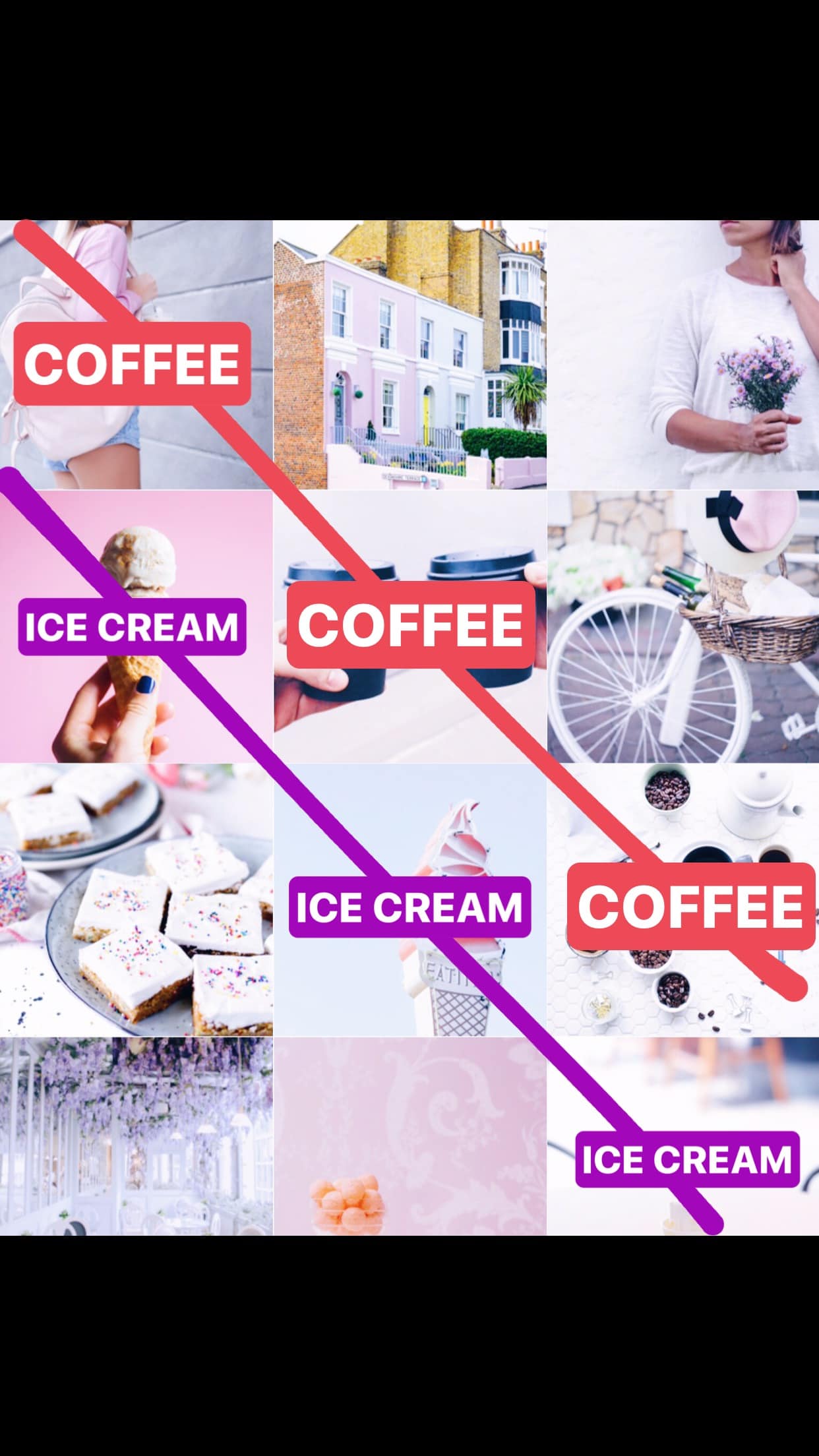
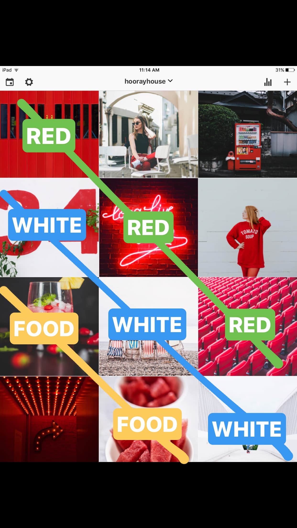
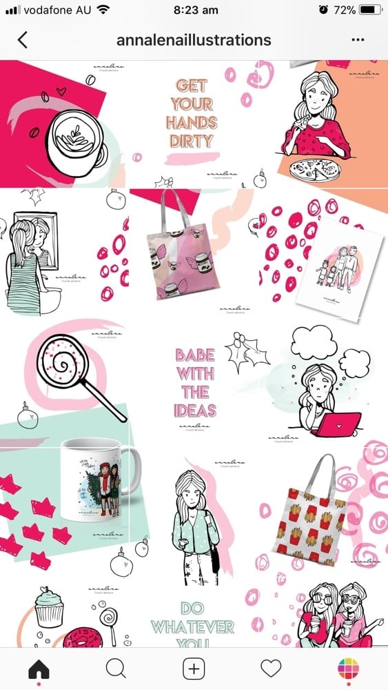
The second Instagram grid layout is used by a lot of Instagrammers. It makes your Instagram theme look consistent instantly. And it’s so easy to do!
The diagonal grid layout was explained by Amanda, the Creative Director of Hooray House, in our Insta Story. You guys loved this trick!
All you have to do is (1) choose a type of photo and (2) choose a color. Then just drag and drop your photos to rearrange them like this:
Instagram Grid Layout #3. Tiles
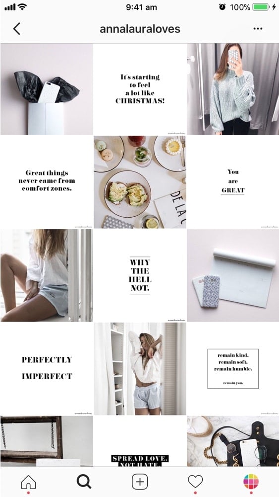
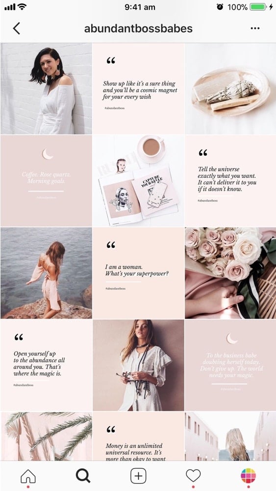
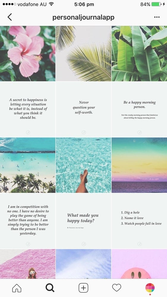
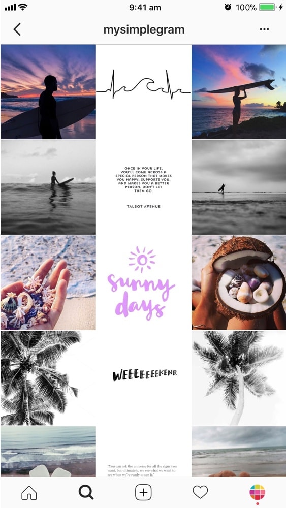
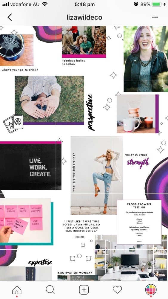
For this Instagram grid layout, use each square as a tile.
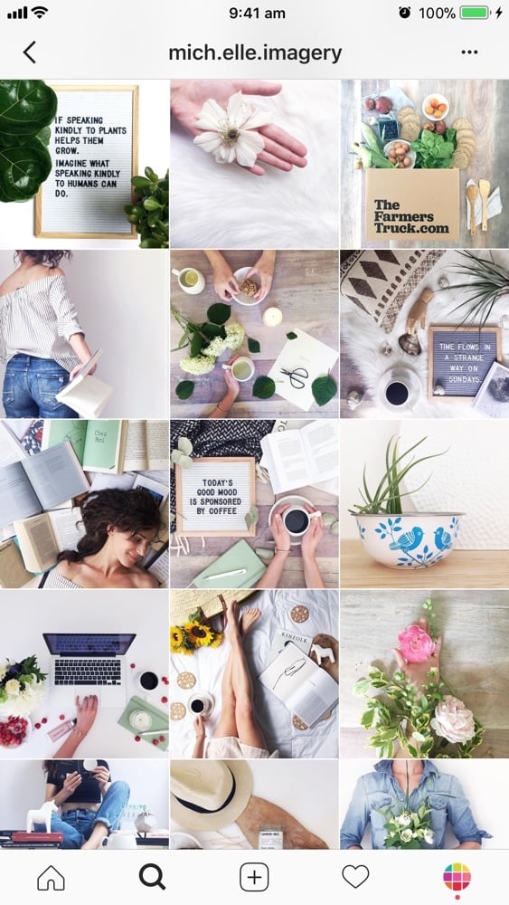
The most popular way to use this layout is by sharing a photo, then a quote, then a photo, then a quote.
It is an easy way to have a consistent Instagram feed. Super easy. Plus, your followers will know exactly what you will post next. If you have just posted a photo. They are expecting an awesome quote after.
Of course, you don’t have to only use quotes. Be creative. For example, you can share your new blog post title, an icon (like a heart), an emoji, a drawing…
Tutorial: How to Make a Tiles Instagram Feed?
Instagram Grid Layout #4. Row-by-Row
This is another creative Instagram grid layout.
It is very beautiful because it looks like you are reading a book… or a magazine. Our eyes naturally go from left to right to read (unless you’re from Japan, then right to left).
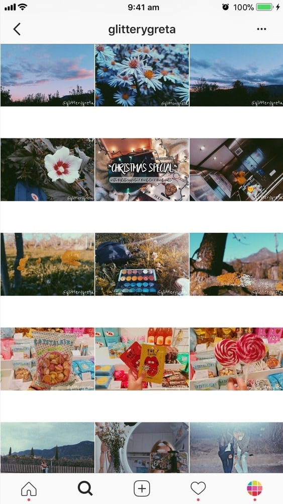
Again, you can get very creative and tell a story. One row = one story.
For example, if you are traveling somewhere you could use a line to write about your travel tips, your experience or the name of your destination.
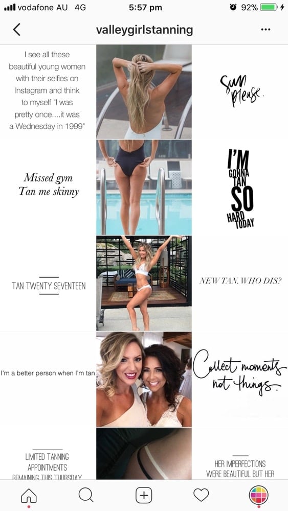
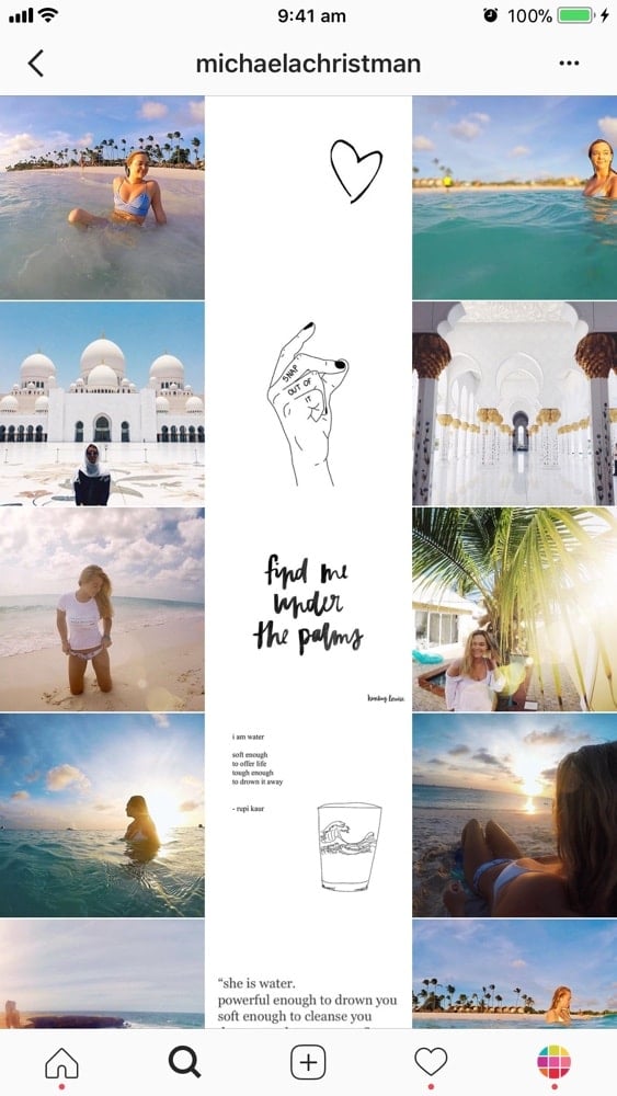
Instagram Grid Layout #5. Line in the Middle
This Instagram grid layout is one of my favorites.
This feed layout is easy to maintain and it is very pretty to look at.
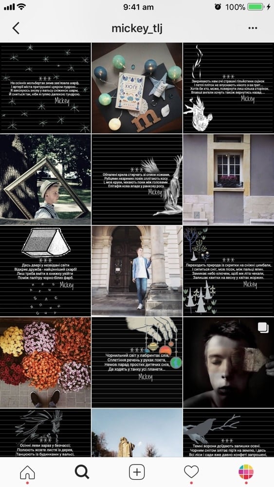
The line in the middle of your feed is usually quotes on a white background. But it can be anything you want.
That line in the middle will guide your viewers as they scroll down your feed.
This is so cool! It just makes you want to scroll, scroll, scroll!
Again, you can get very creative with what you decide to put on each side of your middle photo. You can keep it simple and just post any image. Or you can be more intentional. How does the text in the middle relate to the images on each side? Just a little something to think about…
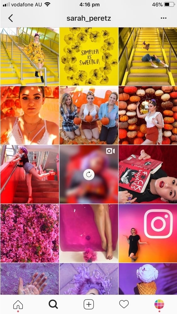
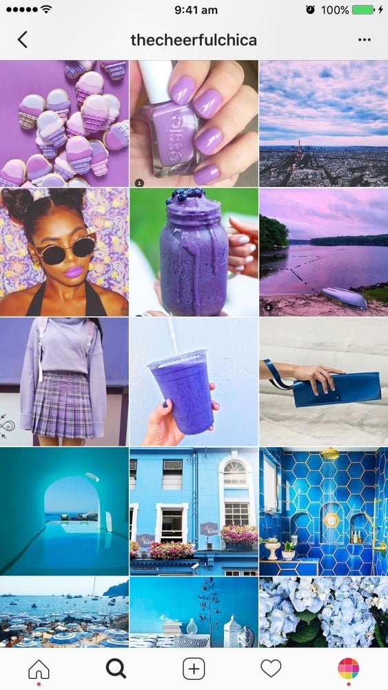
Instagram Grid Layout #6. Rainbow Feed
This is a pretty cool grid layout too. A rainbow feed is when the color of your feed changes when you scroll. It requires a little bit more work and planning than the other grid layouts. If you pull it off, your account will definitely stand out. It will look like a rainbow. Use a different colors in your photos after every 3, 6 or 9 photos for the best effect
Tutorial: How To Make the Perfect Rainbow Feed?
Instagram Grid Layout #7. Borders
This Instagram feed layout stands out too!
Favorite white borders in Preview app: Aura, Sole, Vela. Preview also has other borders like circles and black borders. Take your time to experiment.
Tutorial: How to Add White Borders on Your Photos?
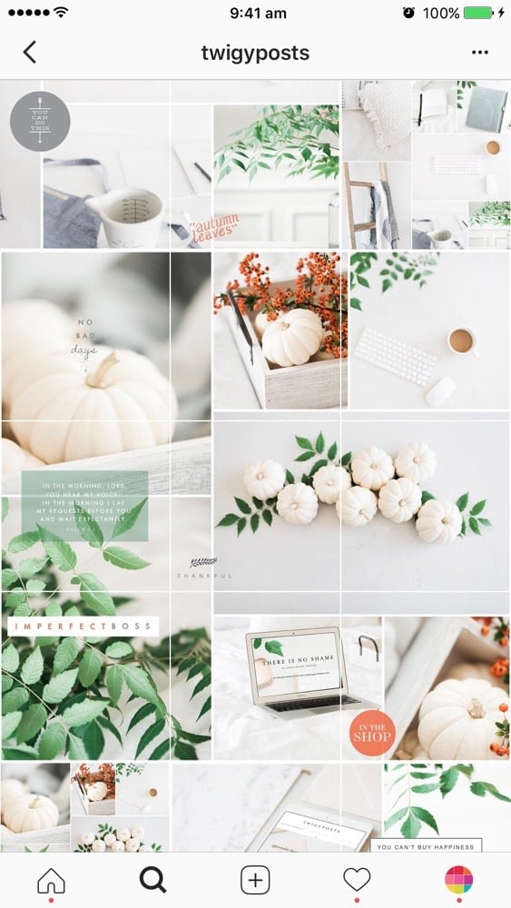
Instagram Grid Layout #8. Puzzle
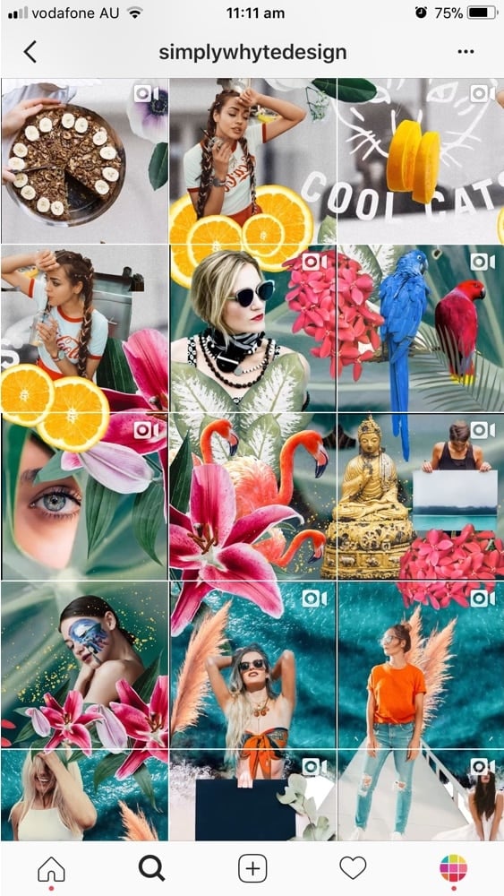
This is a next level grid layout. The trickiest part of doing this layout is maintaining high quality of each single image after you split it. You also want to make sure that each individual photo makes sense on its own (otherwise people won’t click on it).
Instagram Grid Layout #9. Mix
If you want to go one extra mile, try to mix different types of grid layouts:
- @glitterygreta: one row = one story + white border
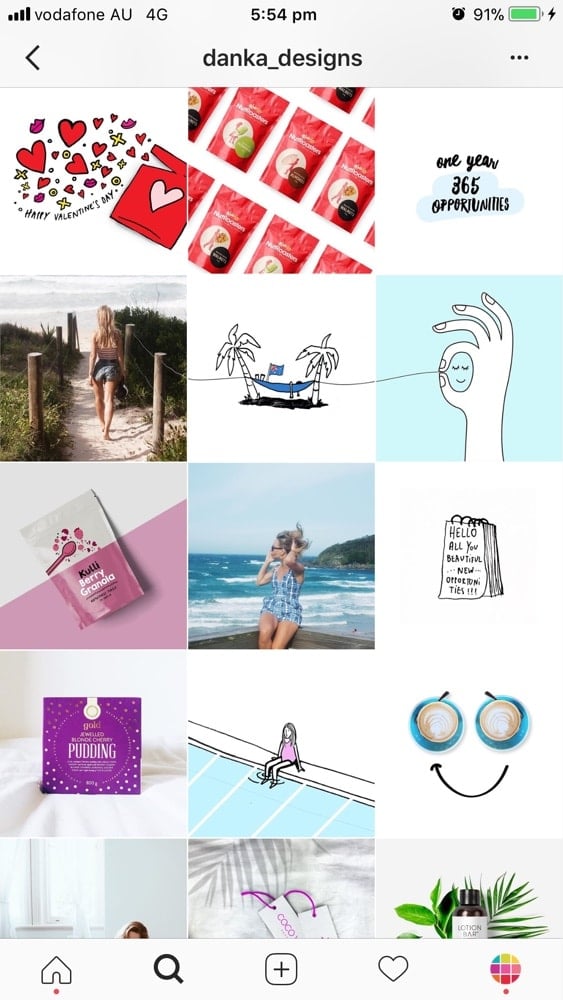
- @danka_designs: puzzle + squares
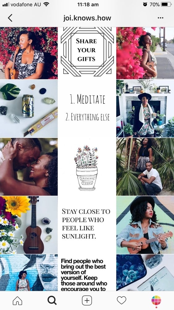
- @joi.knows.how: line in the middle + row by row
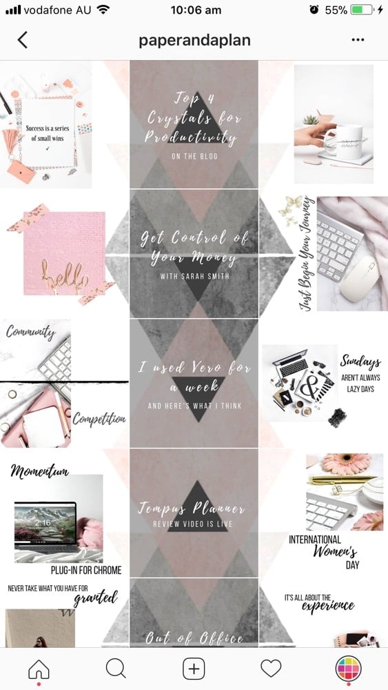
- @paperandaplan: line in the middle + puzzle
If this article was helpful, please leave a comment below.
And if you want more tips to plan your grid, you can download our Complete Instagram Guide.
Have fun!
Alexandra

