I had the best time scrolling through Instagram, on the hunt for beautiful, passionate and successful artists on Instagram.
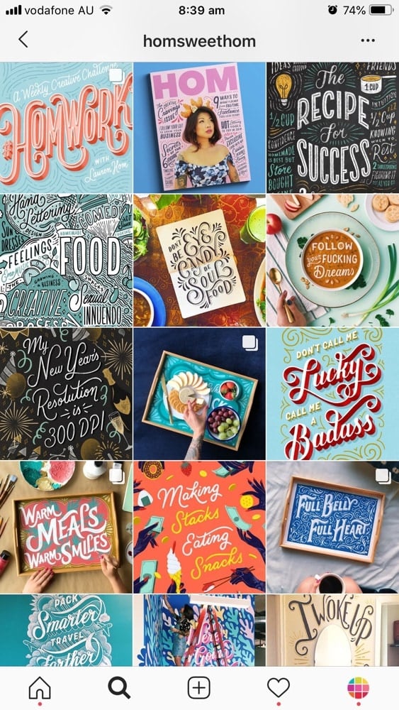
Here are some of my favorite Instagram feed ideas for artists. I have categorised them into 15 different Instagram feed ideas.
There are different themes and grid layouts you can try.
I was so happy to see that a lot of the Instagram accounts you will see are from people who use Preview app to design their feed.
Without further ado, here are some Instagram themes and feed layout ideas to inspire you.
Enjoy.
Feed idea #2. The Color Coordinated Feed
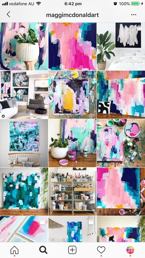
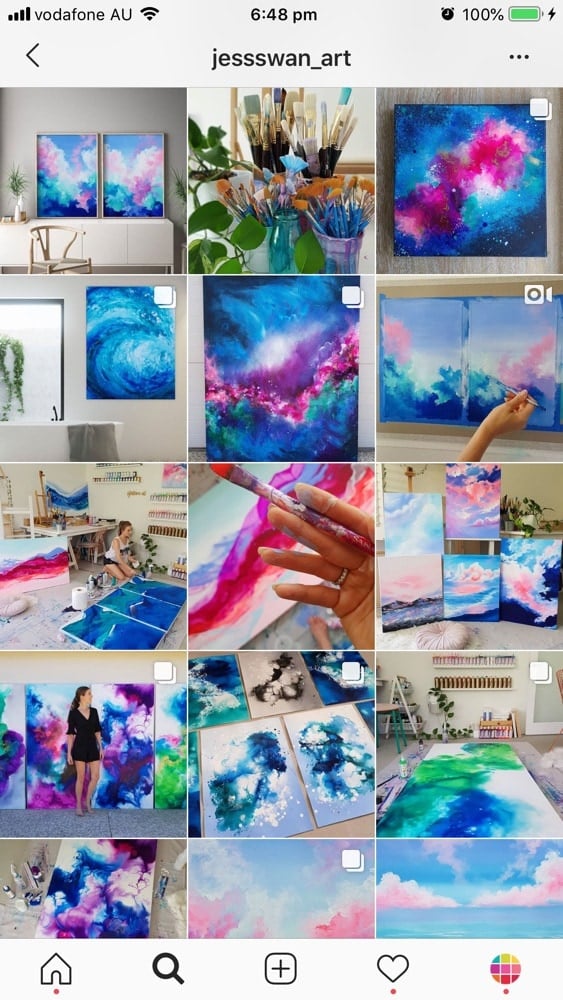
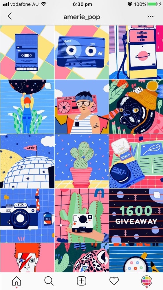
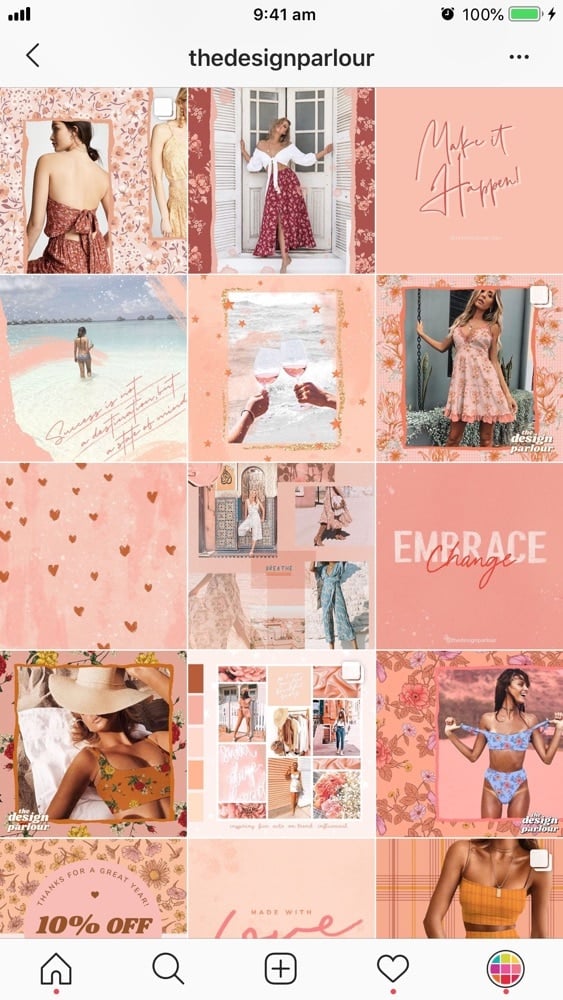
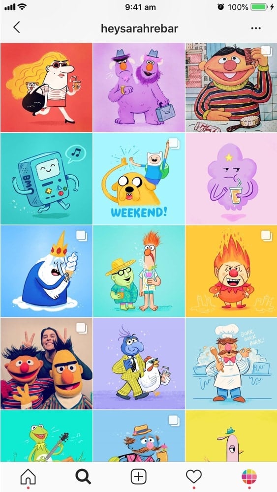
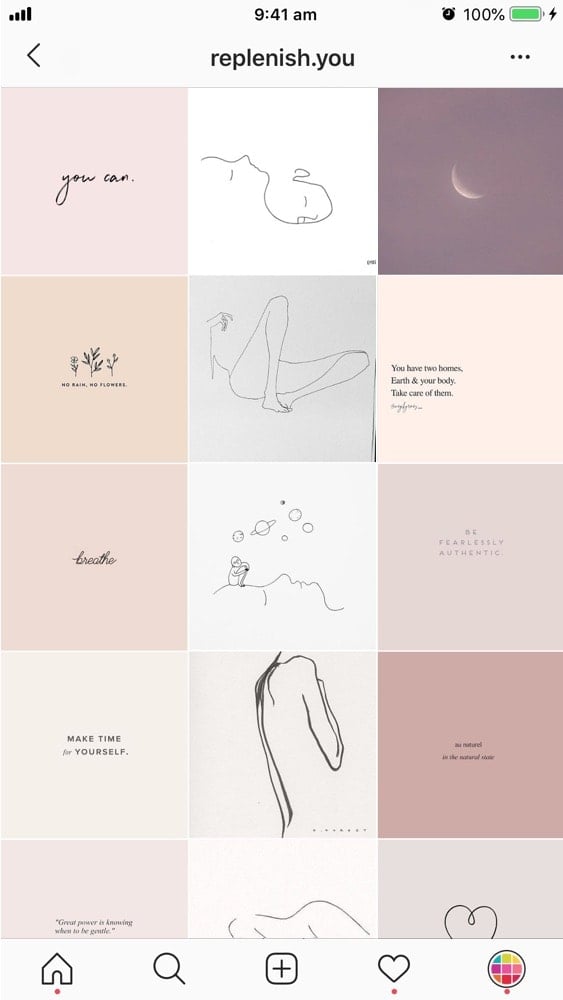
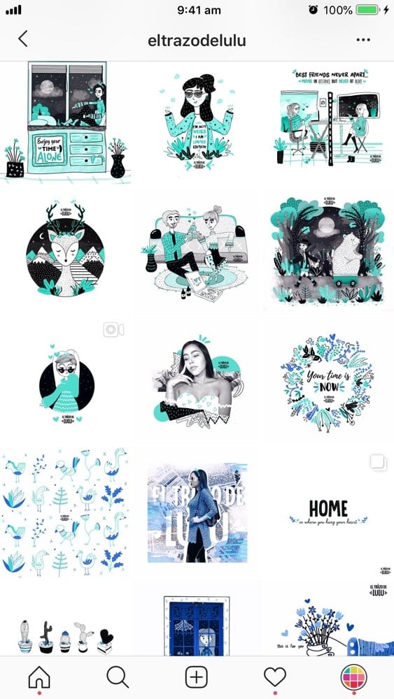
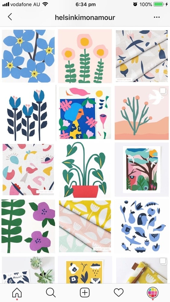
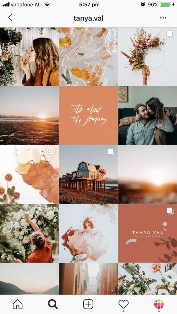
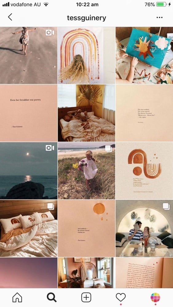
Do you usually stick to a specific color palette for your art? Or maybe you have a brand color? If so, you can stick to your brand colors only.
Feed idea #3. Flatlay
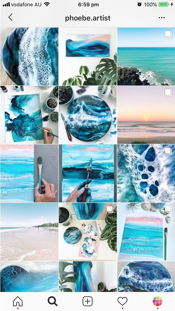
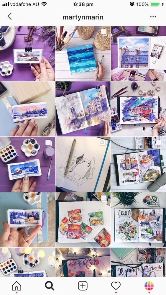
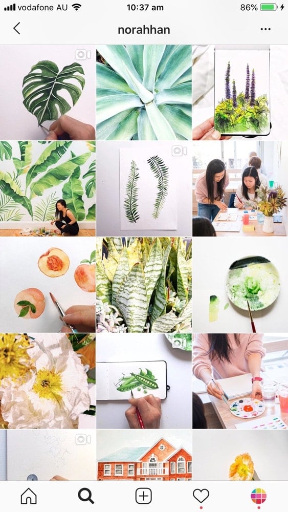
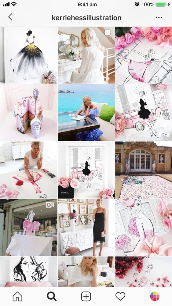
Another idea is to take a photo of your art on a flat on a surface and decorate the space around your art with fun props (= create a flatlay). For example, if your art is about a certain mood or season you can recreate that mood by using different props like leaves, books, flowers, coffee mugs, pencils, brushes, etc…
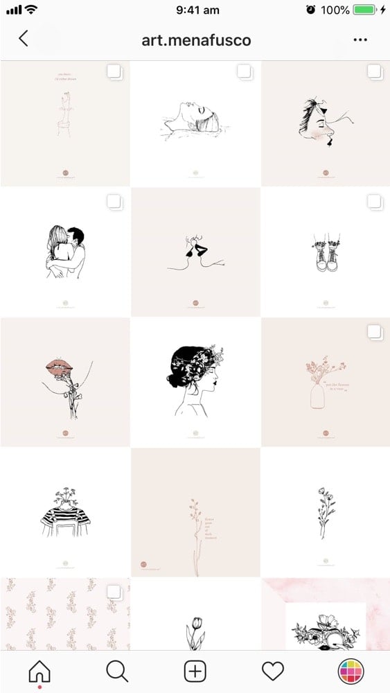
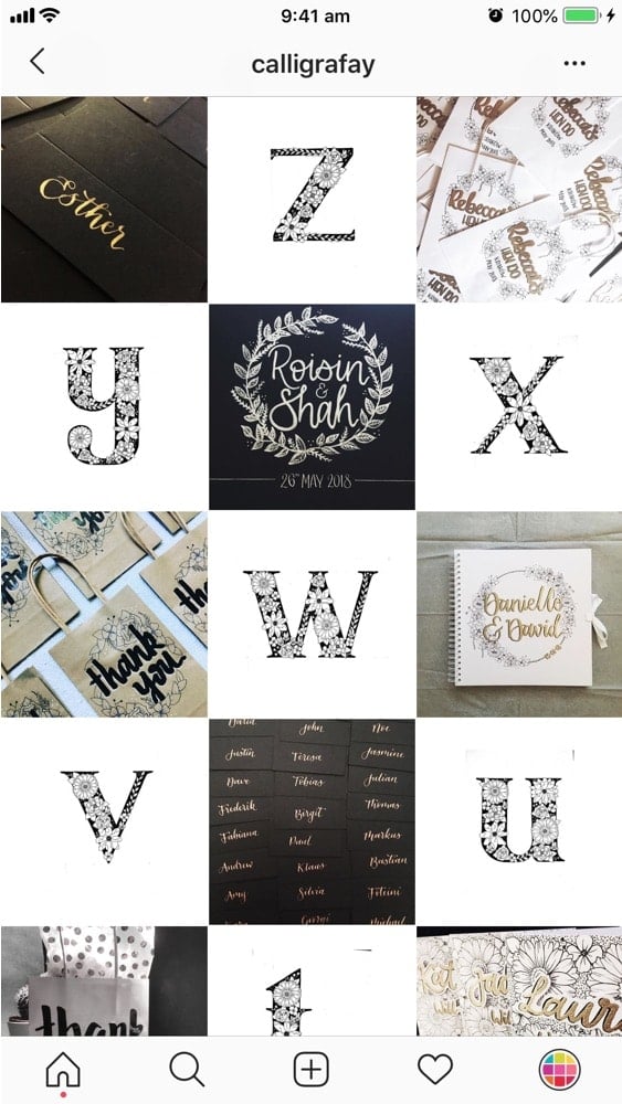
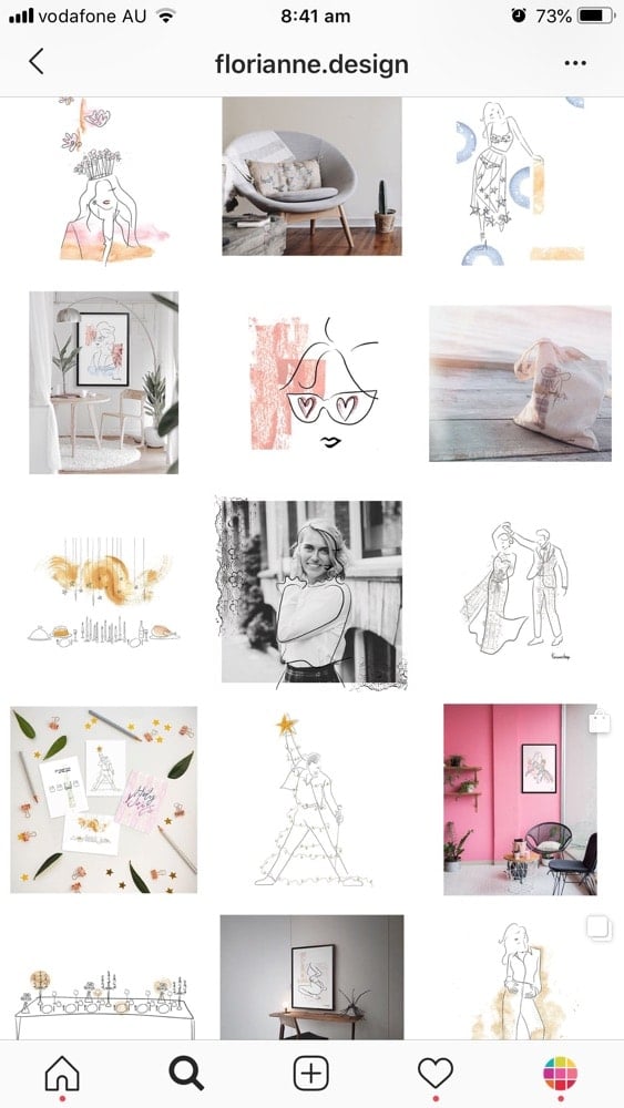
Feed idea #4. White background
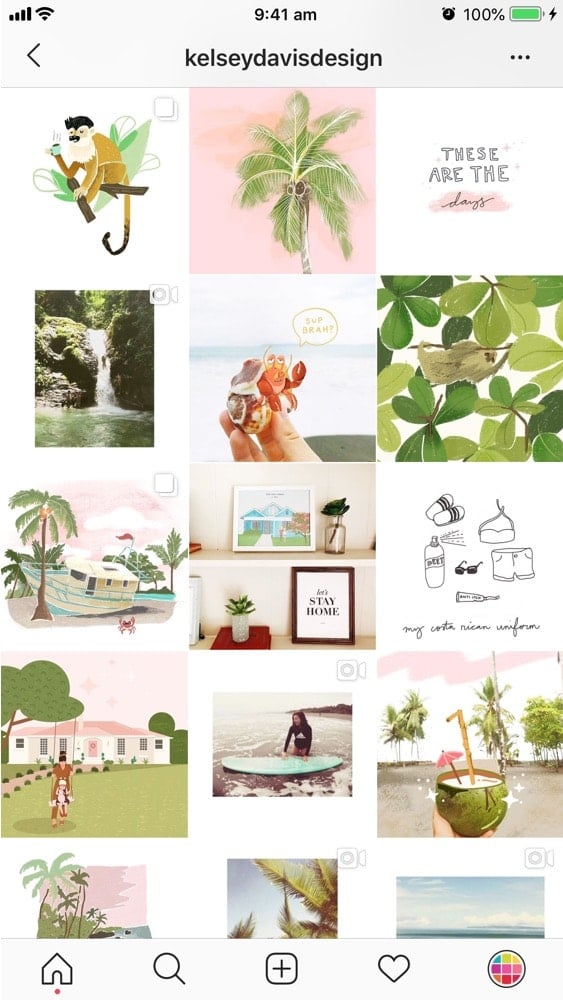
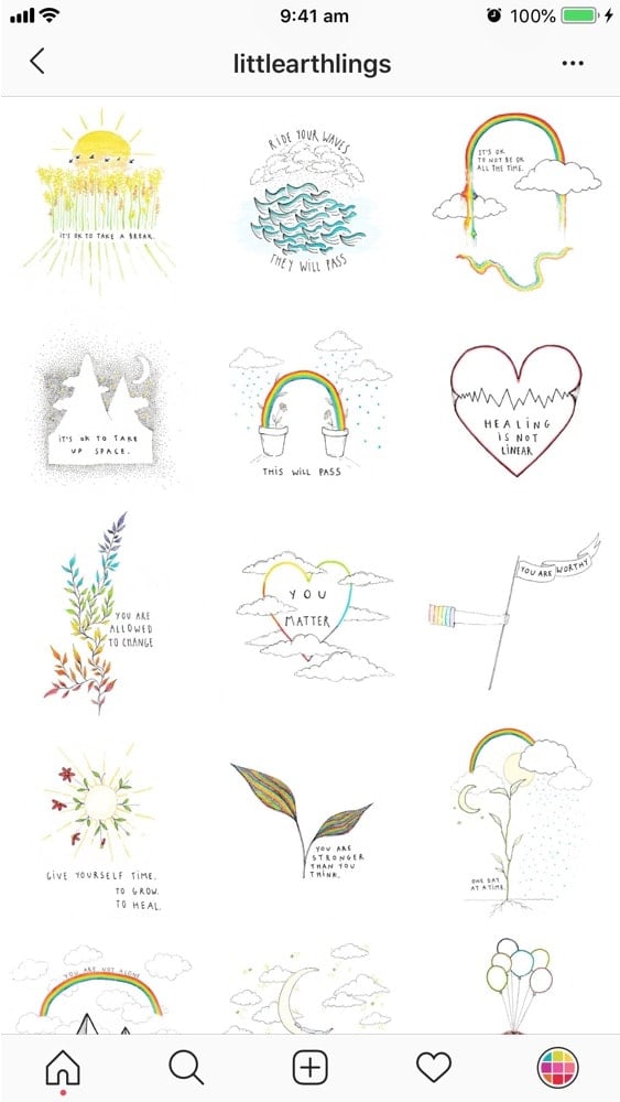
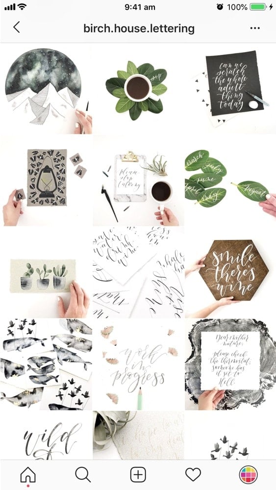
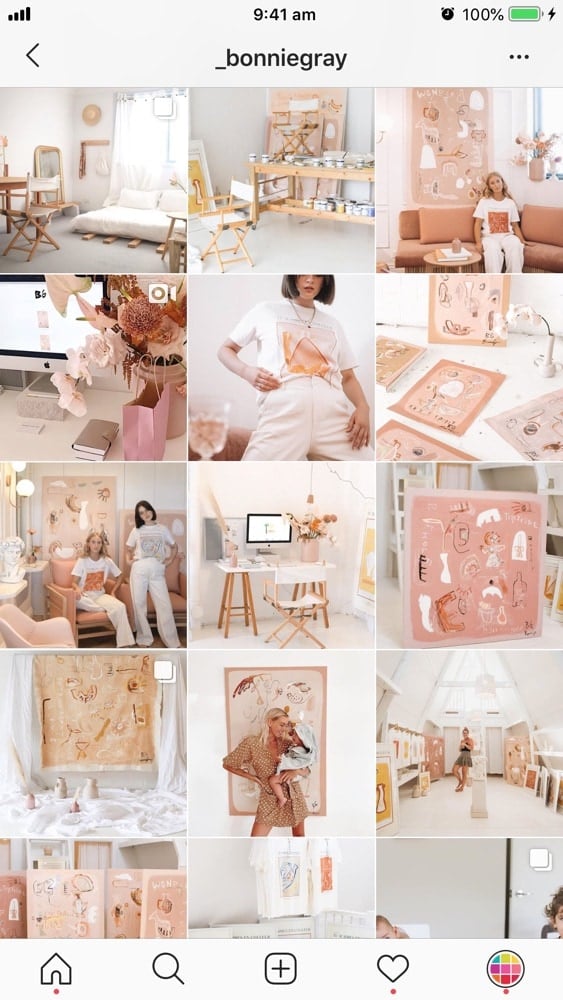
If you want to make your feed look clean and cohesive, try to only use white background for your photos. A white background create space. This will make your art pop even more.
Feed idea #5. Colored background
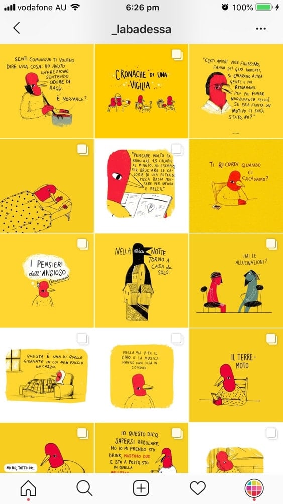
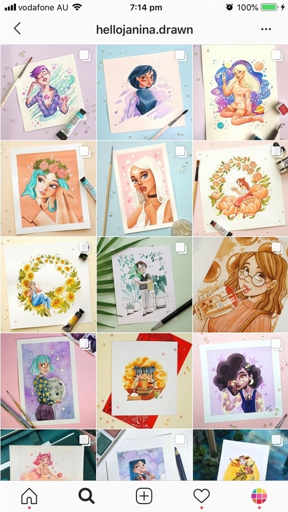
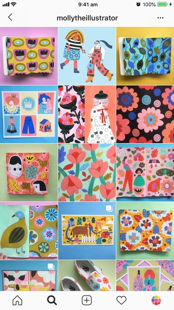
If you don’t want a white background, you can pick a few colors that go well with your art. These colors will be the background of your photos.
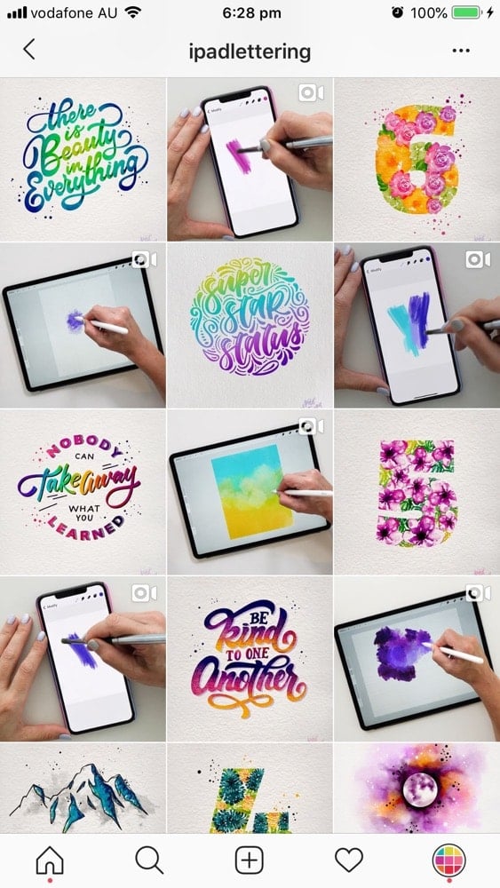
Feed idea #6. Timelapse videos
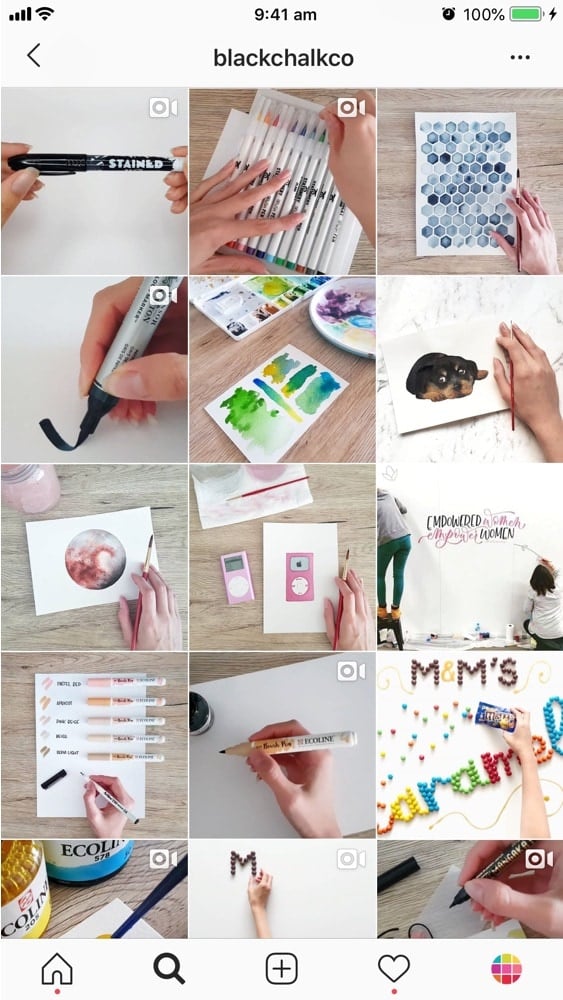
A nice idea is to incorporate videos in your feed. They can videos about your progress, your before and after or a timelapse of you working on your art. Check out:
Feed idea #7. Before & After Carousels
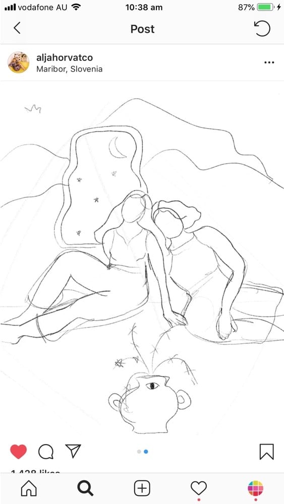
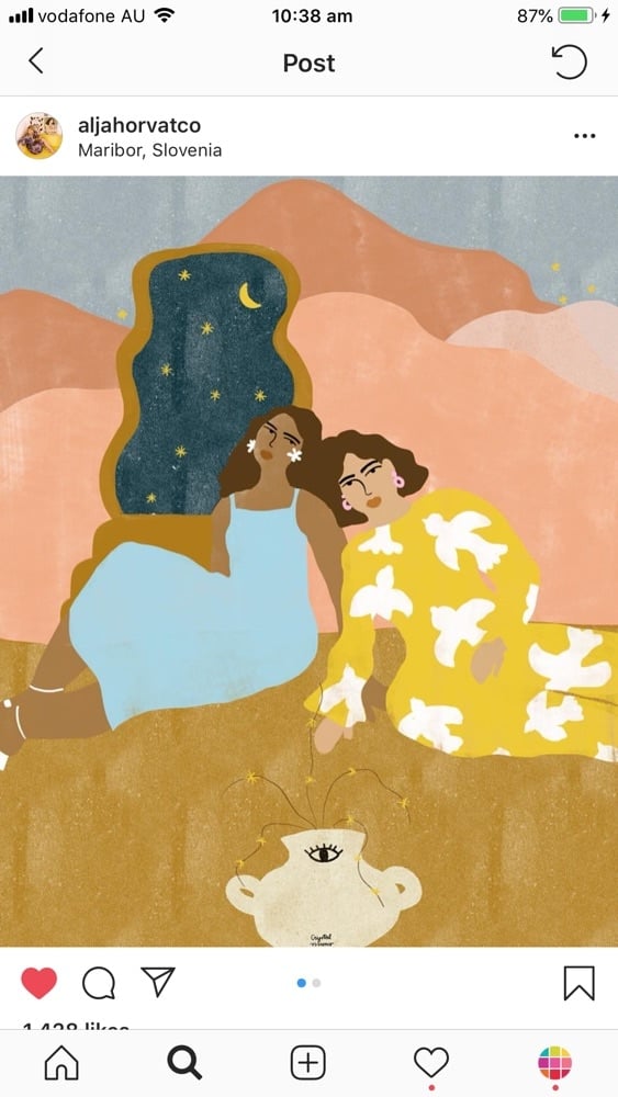
Talking about work in progress, some people share before and after photos. They create carousel posts to show the transformation of their art from start to finish.
Feed idea #8.Tiles Layout
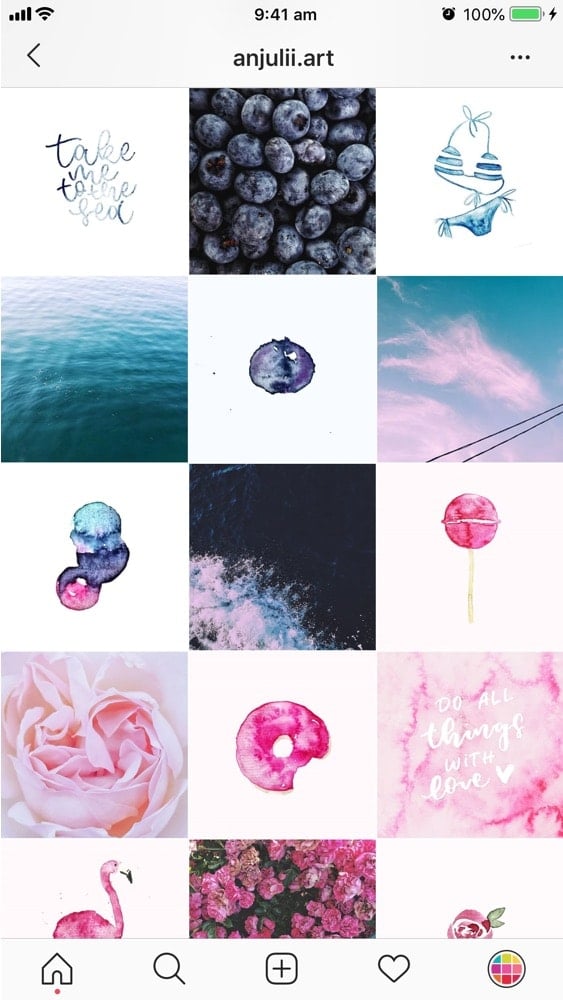
One of my personal favorites: the Tiles Feed Layout. You can use Preview app to design this kind of feed layout. The trick is to alternate between 2 kinds of photos. For example:
- A photo and your art, or
- Two different colored background (black or white, or any other color you like)
The trick is to create contrast between the 2 types of posts.
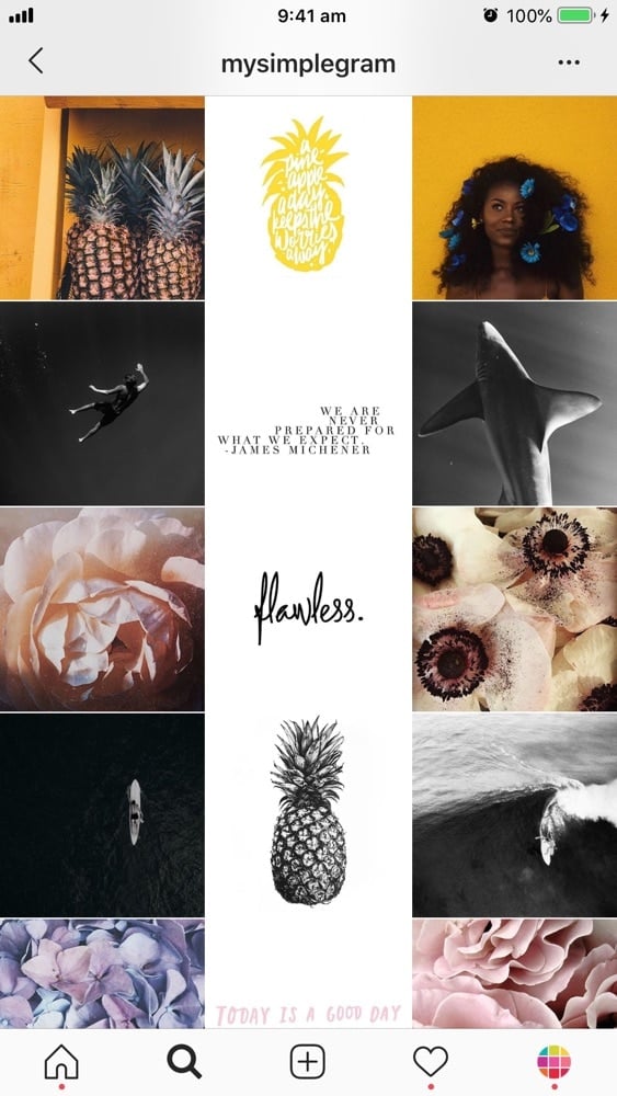
Feed idea #9. Line in the Middle
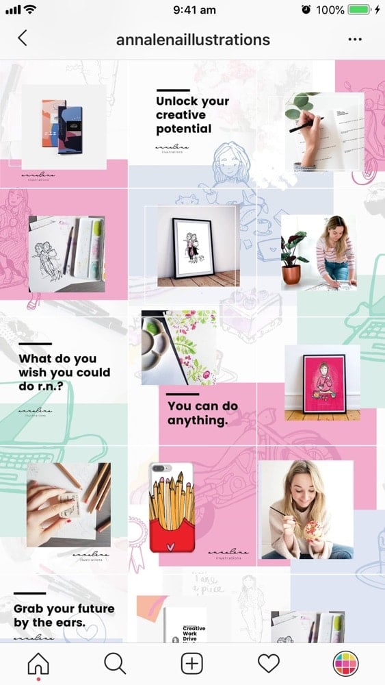
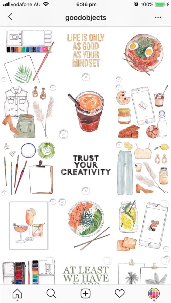
Another beautiful feed idea for artists is the Line in the Middle feed. Imagine your grid has 3 columns and the one in the middle tells a story. Once again, you can use Preview to design this feed. The trick is to decide what you want the line in the middle to be: Your art? Quotes? Photos? The line in the middle will guide people’s eyes as they scroll down your feed.
Feed idea #10. Rainbow feed
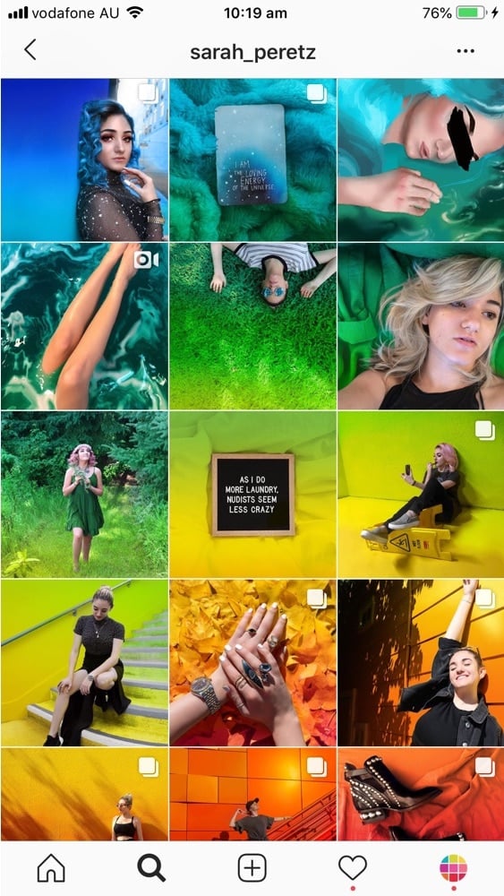
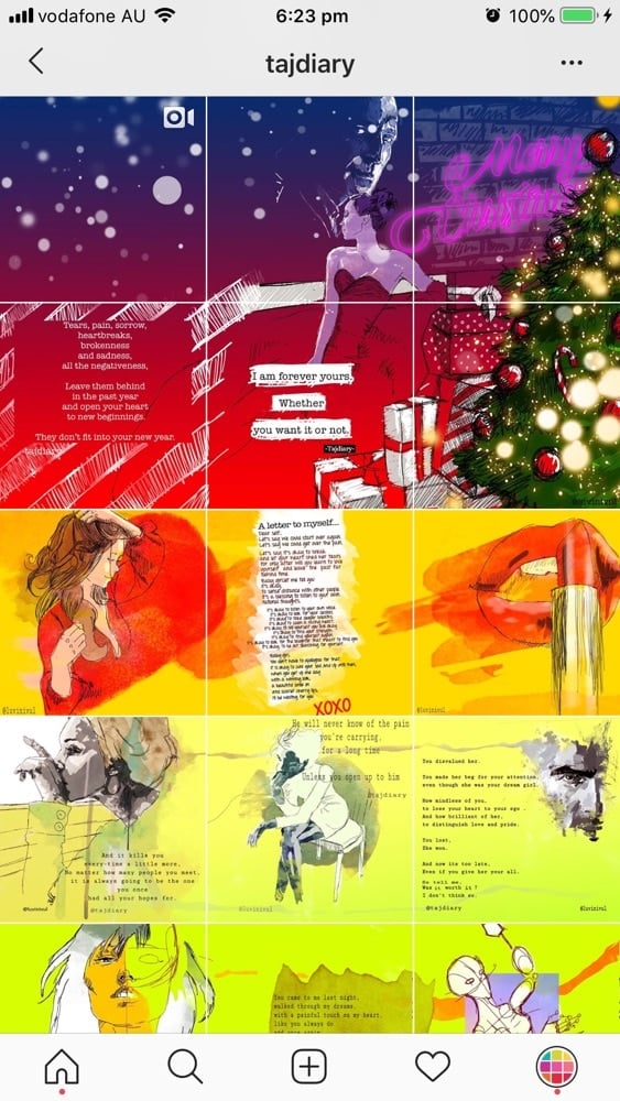
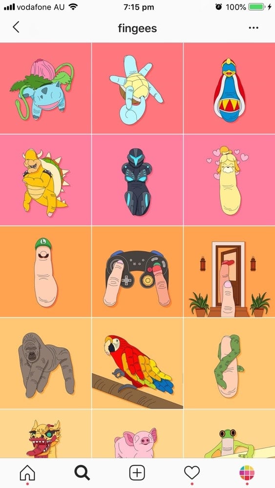
If you take photos of a lot of different colors, then definitely think about doing a rainbow feed. It’s a very fun one to create and you will definitely leave a mark in people’s mind. A rainbow feed is when the colors in your feed change, like the colors of the rainbow, as you scroll down your feed.
I couldn’t find a lot of artists doing this kind of design. But to give you an idea of what a rainbow feed looks like, here are 2 people who are nailing this design:
Feed idea #11. The Puzzle Feed
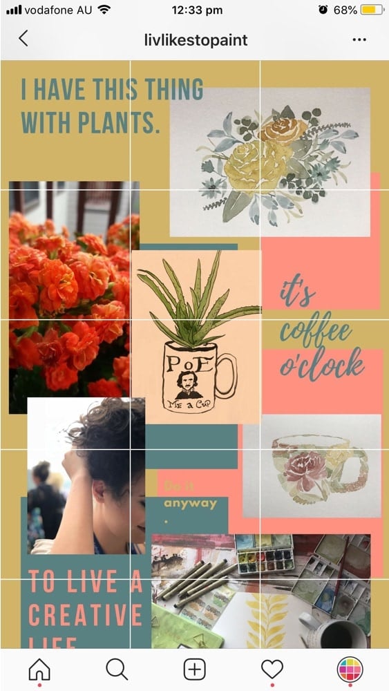
A puzzle feed is when each post in your grid is linked and form a bigger picture. Do you want to try it?
Feed idea #12. White border
You can add white borders around your photos. You can also use Preview for this. I highly recommend this idea if you take photos of a lot of different things, with a lot of different colors and you just want to create some sort of consistency in your feed. The white borders will help you achieve this consistency pretty quickly. Plus the borders create more space between the photos, which in turn make people focus on your art more.
Feed idea #13. Lifestyle Feed
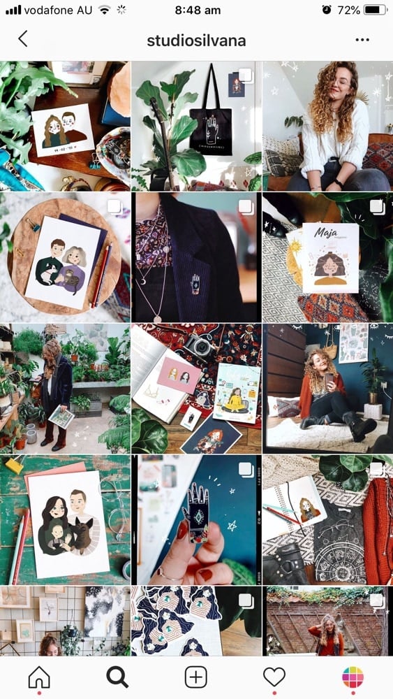
Another idea is to share photos of your art and… your life! You can create a lifestyle Instagram account where you invite people into your personal world. Show behind the scene photos, photos of your home, your work situation, your tools, yourself.
Feed idea #14. A touch of magic
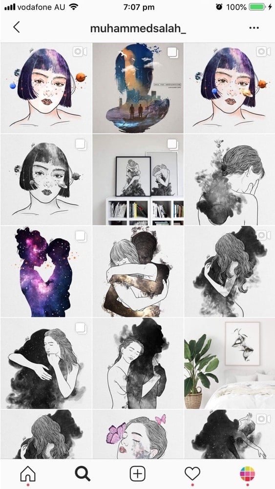
And finally, you can add extra touches to your photos by editing or drawing on some photos. For example, @studiosilvana adds extra brush strokes and sparkles to make her whole feed even more magical and personal. @muhammedsalah_ turns his drawing into moving images, a delight for the eyes.
Feed idea #15. Mix
There is no limit to what you can create. I have found some beautiful accounts who mix and match different Instagram feed ideas.
- @tajdiary: rainbow feed + puzzle feed
- @goodobjects: white background + line in the middle with quotes (every second row)
- @anjulli.art: tiles layout + rainbow
- @fingees: row by row + rainbow
That’s it!
I really hope you found this blog post useful and inspiring.
If you have an art account, feel free to share your Instagram username in the comments below so we can check it out.
And if you know any other art accounts you think we should definitely check out, please share too!
Until next time, see you on Instagram.

