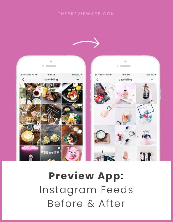
Thank you for sharing your amazing transformations. We’re having so much fun sharing them on our Insta Stories, but let’s be honest. You guys deserve a blog post.
We’re really proud of you, and really humbled to play a part in your creativity.
If you’re new here, all the pages below are designed using Preview App.
@larobe_baby
Fefa now uses filter N7 in the Vintage Pack.
Sometimes it’s all about matching the colors in your photos with the right filter.
N7 is perfect for a relaxing, calm, vintage feel with peach, brown, white colors in your photos.
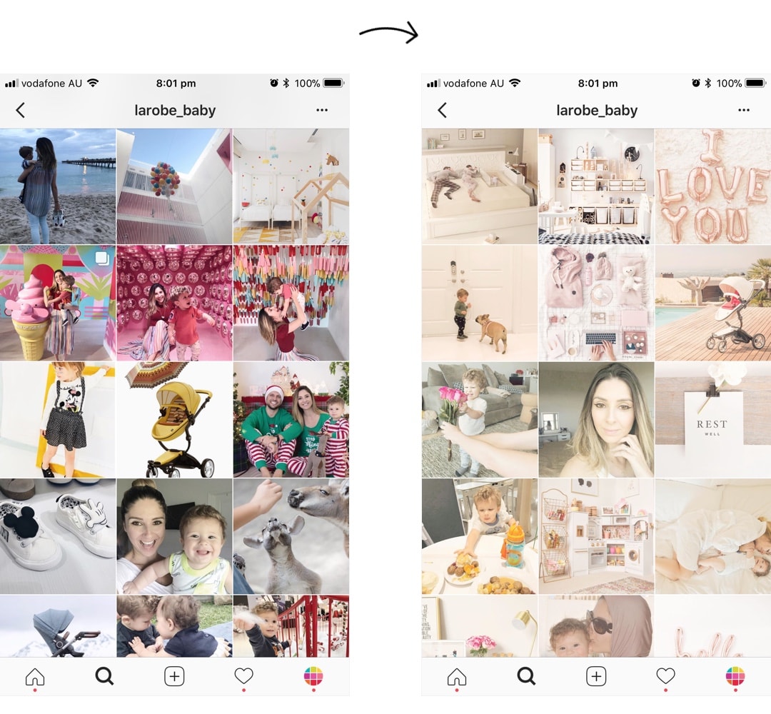
From dark to white theme.
From dark background to white background and minimal photos.
There’s also an accent of pink in the photos now which makes the whole feed come together.
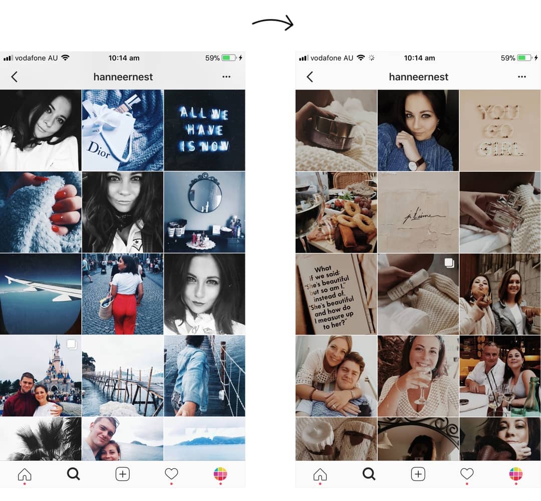
Hanne was one of the very first persons to download Preview app. She has been changing her theme once in a while – and we love it! She started with the Grunge Filter Pack and Black and White photos. Now she has a dark, brown theme. She uses filter M6 in the Dark Pack.
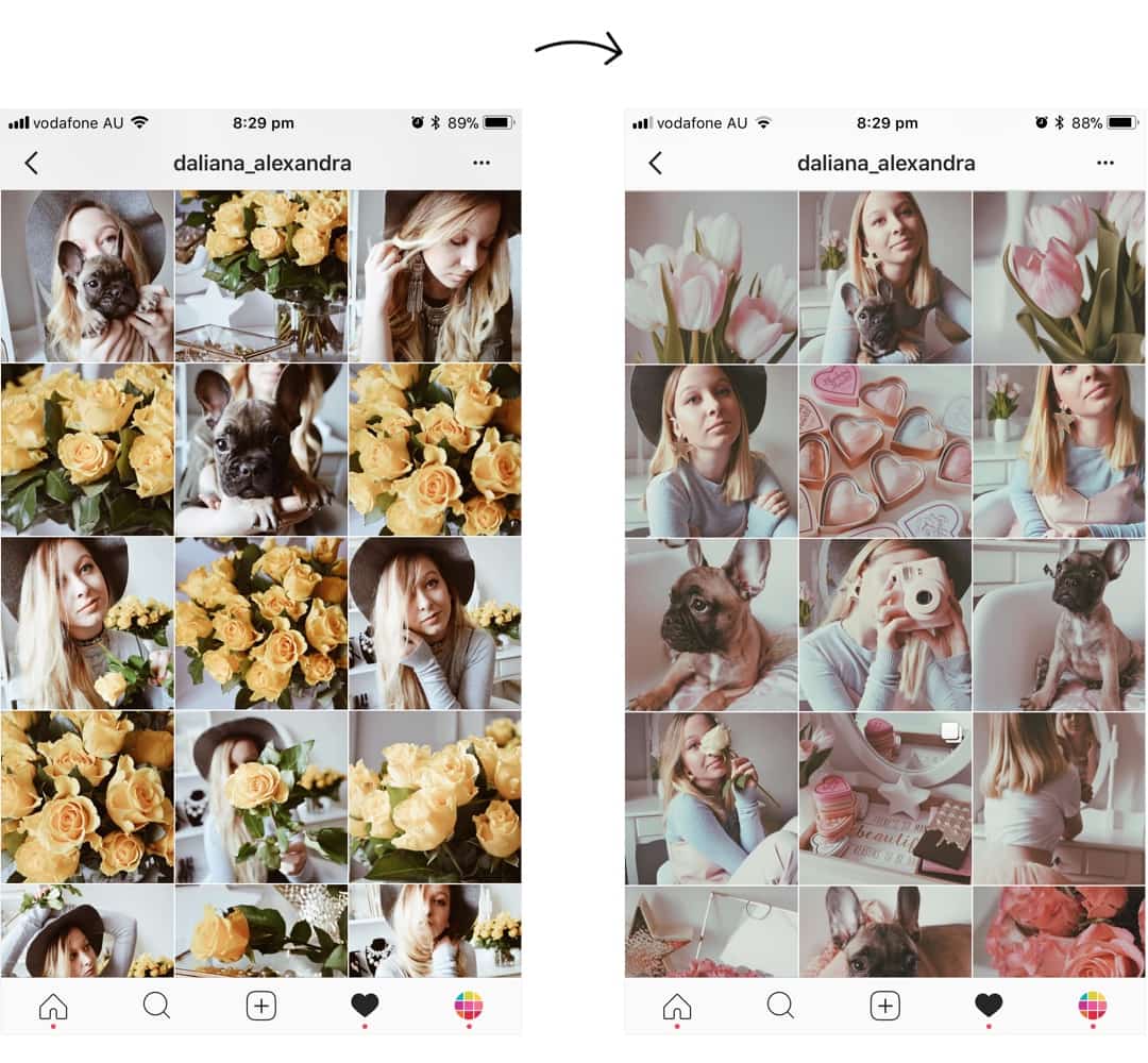
Alexandra has been changing the color of her theme based on the color of the flowers. How cool is that?
She uses filters F3 + F5 in the Brown Pack.
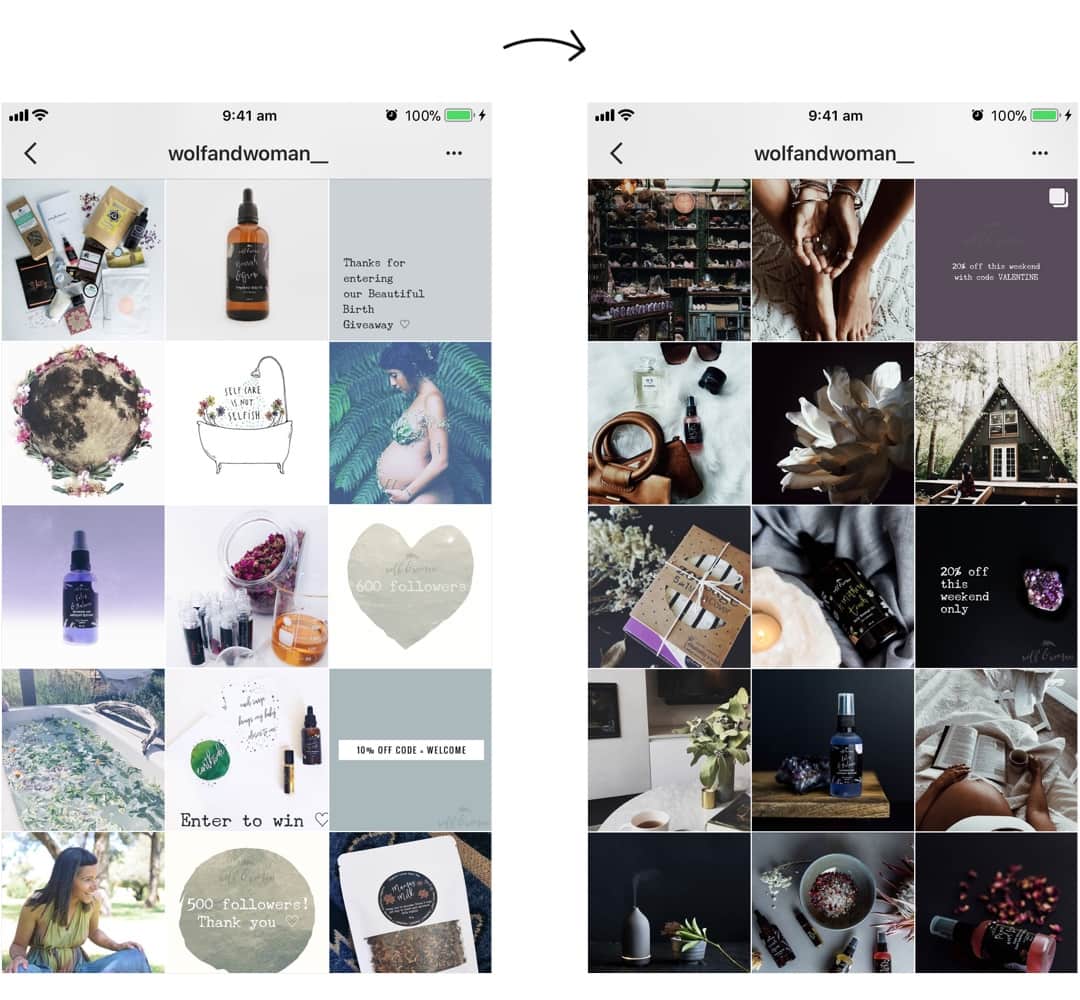
Wolf and Woman also transformed their feed drastically. They chose to create a dark, moody, earthy feed. They now use filter M… in the Dark Pack. They key to a moody theme: photos with dark and brown elements in them (dark objects, dark background or wall, and shadows).
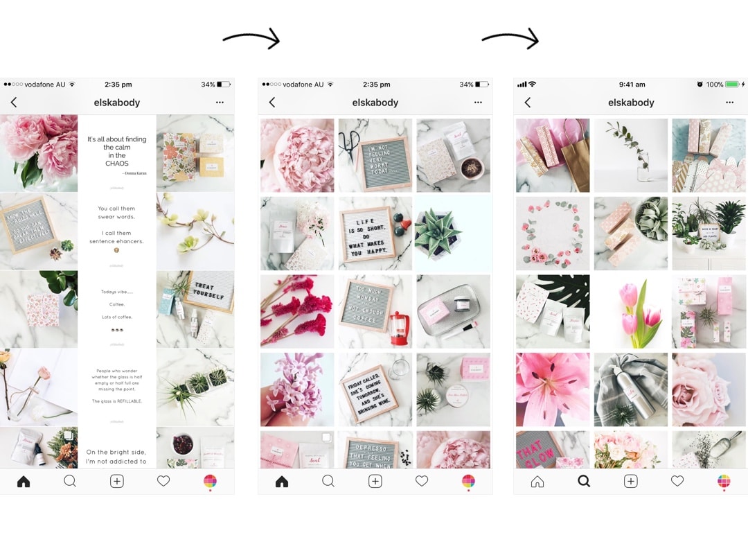
Hilda from @elskabody has also been using Preview App since we started (hello Hilda!). She changed her grid layout a few times. She started with the Line in the Middle Layout with quotes in the middle. Then she changed to quotes on a letterboard in the middle. And now she posts photos with white border “Aura”.
She uses filters in the White II Pack: filters DD5 + DD6
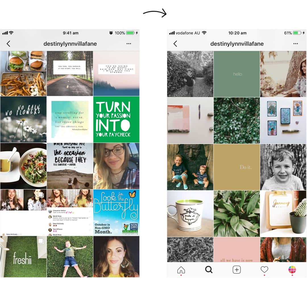
A few little tweaks make a huge difference. Destiny Lynn has a new earthy style and a new grid design. This means:
- Stick to her favorite filters A2 + A4 + A7 (in the Preview Filter Pack)
- Choose a color palette for her theme (earthy colors: brown, black, green, white)
- Post more photos of nature
- New templates for her quotes with earthy colors and fonts
- Quotes every second row in the middle
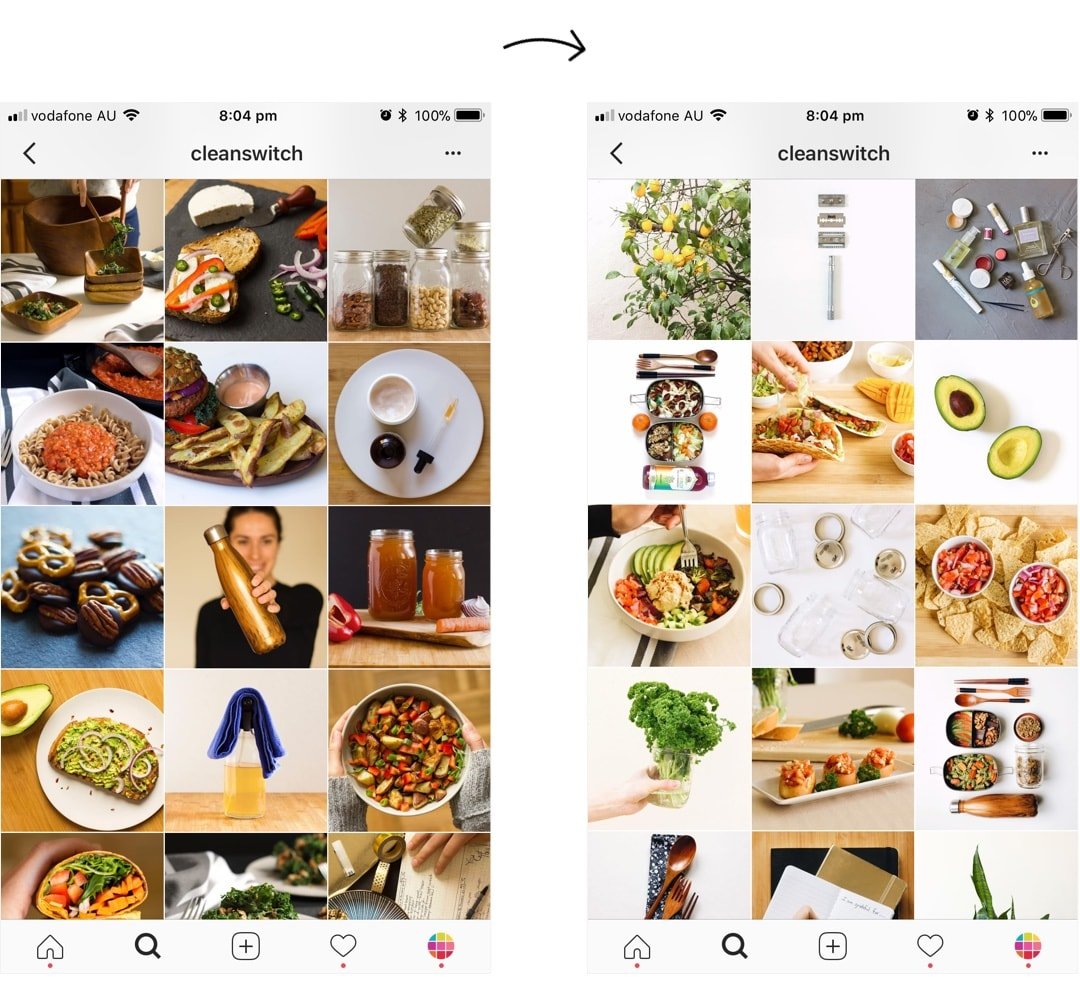
Allie from @cleanswitch literally made a clean switch:
- White, clean background
- Minimalist photos
- More negative space in her photos
- White background
We’re so proud of these girls! They completely transformed their feed. They are color coordinating their feed. They also have a cool transition between each color, to announce the next color. How cool?
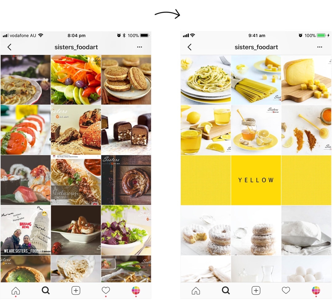
@emeryandopal
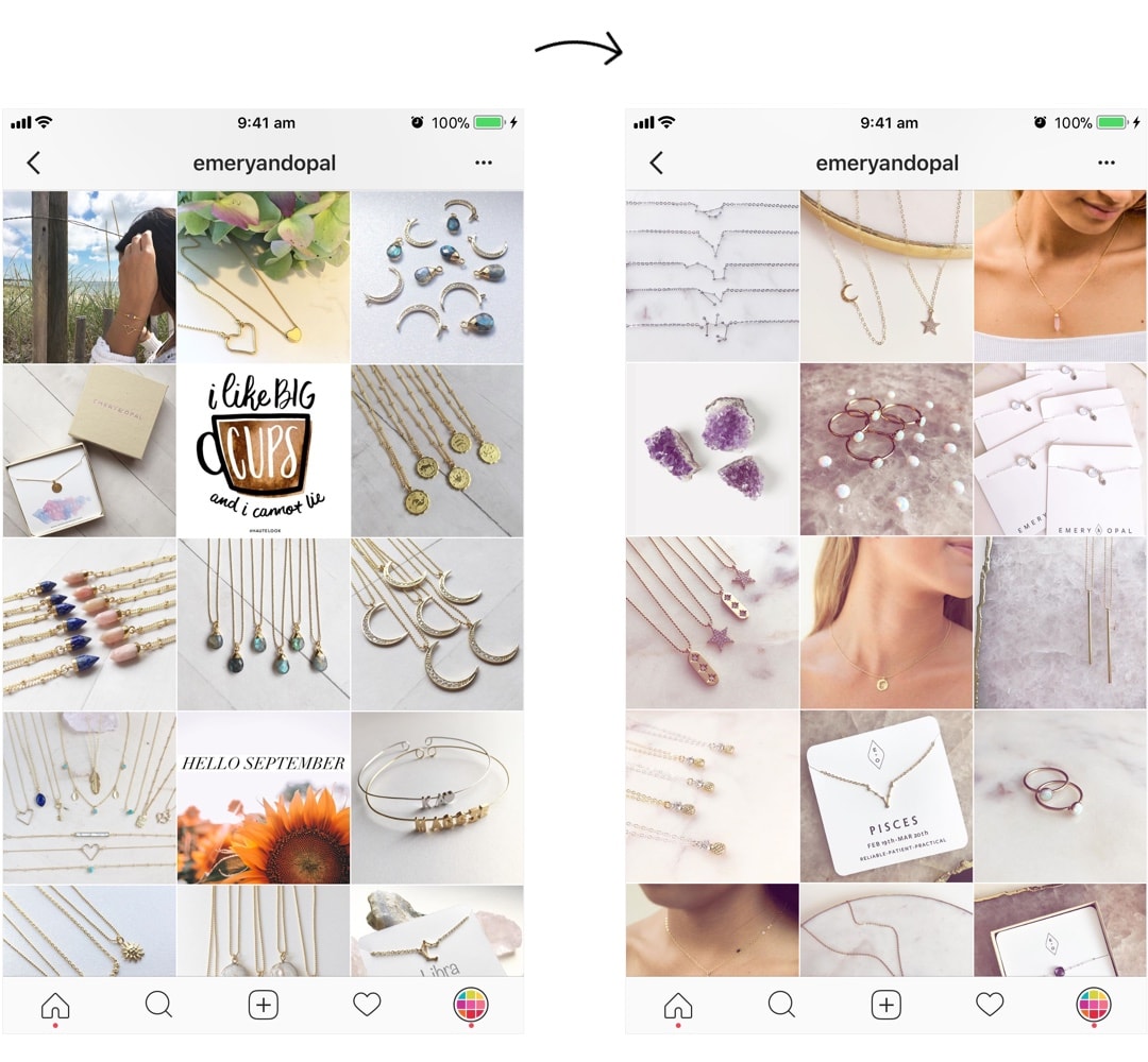
We always say it: “Treat your Instagram feed seriously so your customers treat YOU seriously”. And look at that transformation! Waow! Amanda and Tiffany are making their jewelry stand out in their new feed design. It’s calm, peaceful and professional:
- Stick to the same filter
- Stick to the same background
- Introduce skin
- Good lighting
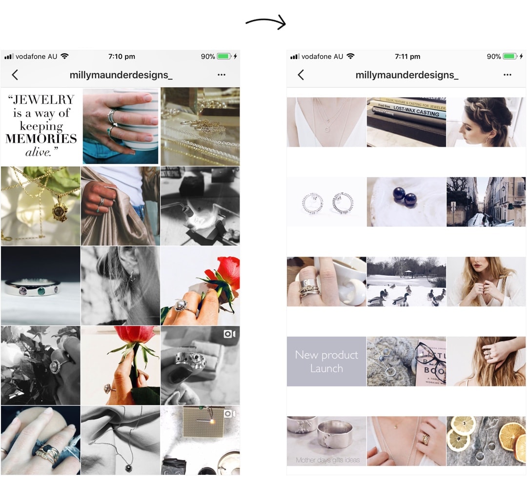
Another beautiful transformation for Milly’s business page too! It looks beautiful:
- White Filter Pack
- White border “Sole”
- White background on photos
- Color palette for her feed
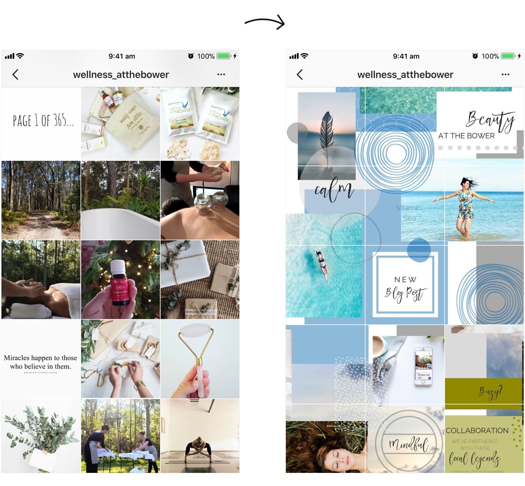
And the last one is from our friends at Wellness at the Bower. They have completely transformed the look of their feed. They created a Puzzle Instagram feed.
Do you want to make a puzzle feed too? You can follow the tutorial here.
Ah! We have a big smile on our face now.
We would love to see YOUR Instagram transformation. Please leave a comment below with your Instagram username. We’ll come have a look at your page too.



Hi, I have recently started using Preview themes and have fallen in love with them. I am using F2 right now and my feed has shown such a drastic improvement. My username is @debasrideb
I have a question on the use of borders. I understand the picture must be cropped in a square for this to work, but I am an artist displaying my paintings, many of which are horizontal. Could I make a carousel for something like this, with the first image being the square with the border, then my rectangular images following? username: @maureenjdunlap