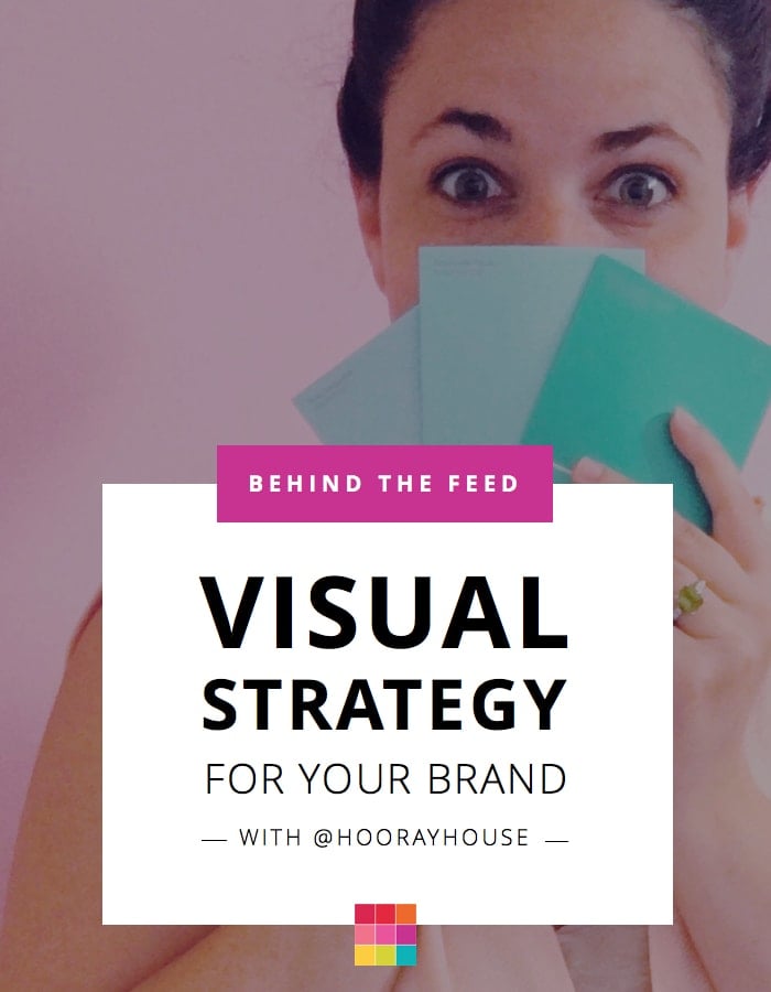
Time for a new “Behind the Feed”! Amanda from @hoorayhouse has been using Preview App and sharing all the themes she created using Preview on her Insta Stories. I HAD TO invite her on our blog to spill the beans. She has amazing tips to help you design a cohesive Instagram feed for your personal brand or business. Read until the end because she will show you how she takes her own photos and brand them.
Hi Amanda! Can you introduce yourself and tell everyone what you do?
Absolutely! My name is Amanda Fleischer and I own Hooray House Studio which offers branding and visual strategy services. Specifically, I help small business creatives fine tune and develop their visual presence online and that could be anything from creative direction, to visual merchandising, to social media planning.

Instagram is a visual platform. Why is it so important to have a visual strategy for our personal brand or business?
That’s a great question! Having a clear visual strategy especially for a platform like Instagram is pivotal in setting your business apart from others in your same industry.
You have a very limited amount of time to grab someone’s attention and pull them in, and a visual strategy helps you do this. A successful Instagram feed should be pulling in new followers constantly, not just when you’re on the platform actively engaging.
That is entirely predicated on how your feed looks and how your content performs even while you’re away from your devices. My background is in retail. Retailers have been relying on visual stimulation forever. Think about mannequin displays and the signage you see in any of your favorite retail chains. I’m just applying those same concepts to social media. You might not have mannequins and you might not be selling soft goods, but visual marketing is still just as important.
The great thing about Instagram is that every photo upload is another opportunity to impact your audience with content that is impactful, stimulating, informative and enjoyable.
I know how serious you are about creating a consistent visual strategy for businesses. How do you choose the right colors for a brand & Instagram feed?
I have a process that I guide my clients through that asks them to get really reflective on the kind experience they want to create.
I think people sometimes forget that branding is more than just a logo or web design. It’s about the total experience, so I help my clients get really intentional about how they want their audience to feel about their business and then we go about selecting colors and brainstorming photo shoot concepts based on those ideas. Instagram specifically should be an extension of your website and that experience needs to stretch to all social media platforms.
How many colors should we focus on for our feed?
That’s an entirely personal preference. I’ve worked with business owners who use the same two colors in every photo, and I’ve worked with others who use a lot more.
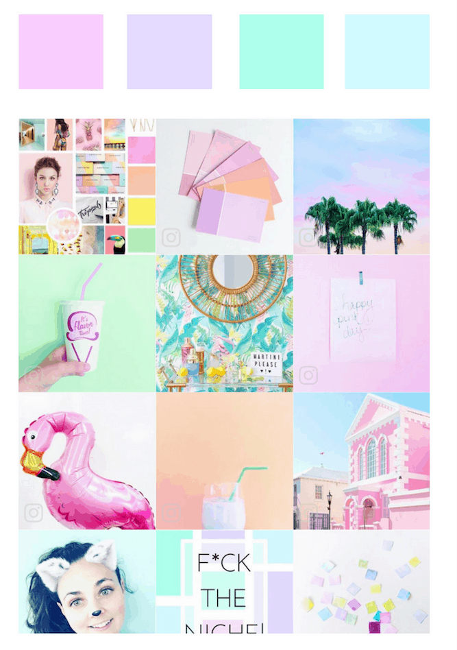
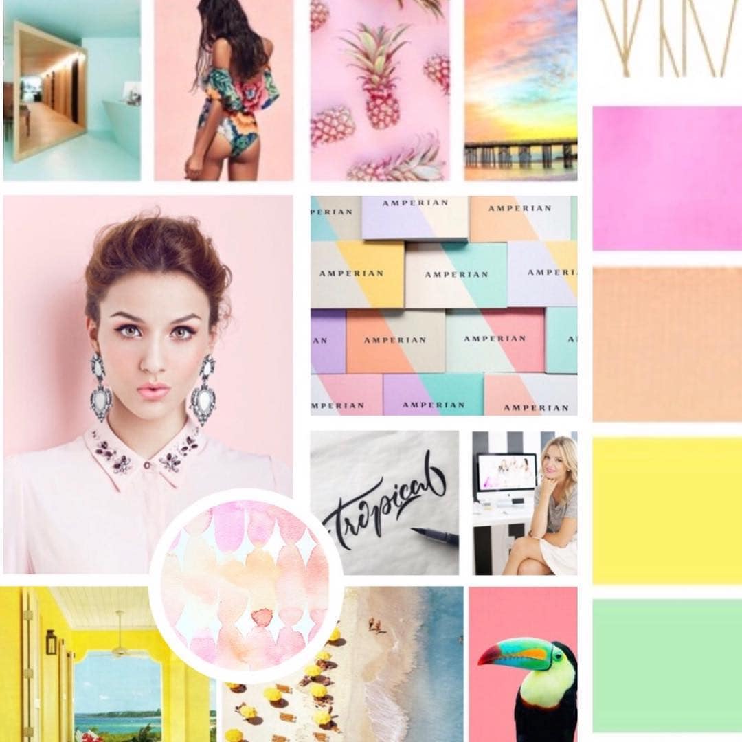
I think picking tones can be more important than settling on color sometimes. Do you want bright tones? Neons? Pastels? Dark tones? Jewel tones? Earth tones? That can make a ton of difference in the cohesiveness of a feed, especially if your business is new and you’re not yet comfortable committing to a color a palette.
What is your top tip to keep a cohesive theme on Instagram?
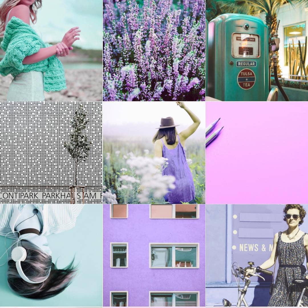
The diagonal feed planning concept I offered my followers and clients is helping a lot of people! It a little harder to explain than to show, but the biggest advice I can give is to make sure you stagger similar colors and depths. Make sure photos with similar content and depths aren’t touching either next to each other or on top of one another. We talk about a cohesive feed visually, but the subject matter needs to be diverse and offer variety. It should tell a well rounded story to keep your followers interested and engaged.
Your top 3 tips to take branded photos for an Instagram feed?
So I know most everyone is doing one of two things; taking iPhone photos or professional photos. If you’re taking iPhone photos my top tips are:
1. Framing is so important! Pay attention to clean and clear frames. Make sure the lines are straight and framing is straight and there’s nothing that breaks up the background color around the edges.
2. Lighting is next. Good lighting can make or a break a photo. In getting intentional about how you want your feed to look, dark pixelated photos have to be designated for Instagram Stories because they will throw off the quality of your feed.
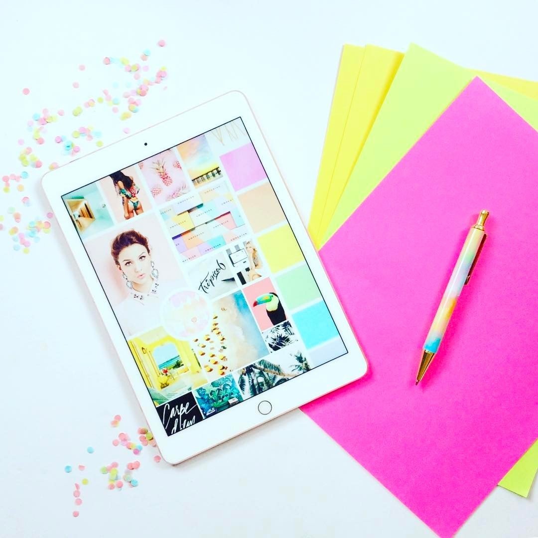
3. Plan in advance. I don’t suggest snapping and uploading in the moment if you’re just starting feed planning because that can disrupt your feed. Preview App is my life saver in seeing how my feed will look before posting.
Let’s talk about your own Instagram feed. If you could use only one word to describe it, what would it be?
Celebratory!
Which is entirely intentional given the name of my business.
Where do you find inspiration? Where do you even start when you plan your feed and photo-shoots from scratch?
I get inspired by other artists and by staying present. I don’t like the idea of regurgitated content and I don’t like the idea of my account being confused with someone else’s so I try to keep it as fresh as possible.
I think content creation is about documenting, so I just try to capture creative moments as they’re happening throughout my day. Every day.
I also plan shoot days for bigger projects which require research. Pinterest is always a good starting point.
Being present and aware of your surroundings is always important because you never know when an opportunity to snap something feed enhancing might pop up. If your Instagram feed or your business branding in general is hard to upkeep then I would consider rebranding. I say this because it should come fairly easy. If your life and your branding run on a parallel trajectory it will be much easier to maintain, and since branding is so much about explaining who you are it is kind of important that there are similarities. The content rolls in when you can easily find content ideas rather than driving yourself crazy about it.
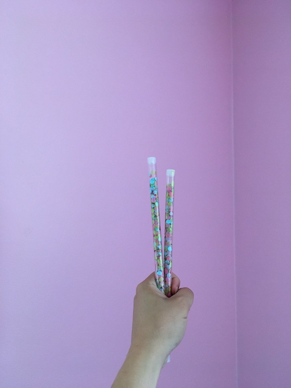
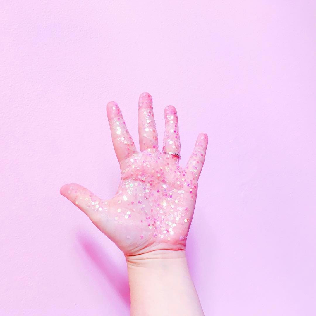
How do you get these solid background colors in your photos? (pink, purple, blue etc…)
This kind of piggy backs on my last point. My house has a lot of pastel walls. I use them regularly for backgrounds. This was another intentional decision . I made my branding colors, colors I have easy access to daily. Since my life and my brand run on a parallel trajectory it’s super easy to create and maintain branding and content. You can also use poster board, or use backdrops, walls, and murals in your local community!
Pastel boards are amazing!
Walls are great too. This is before…
And after:

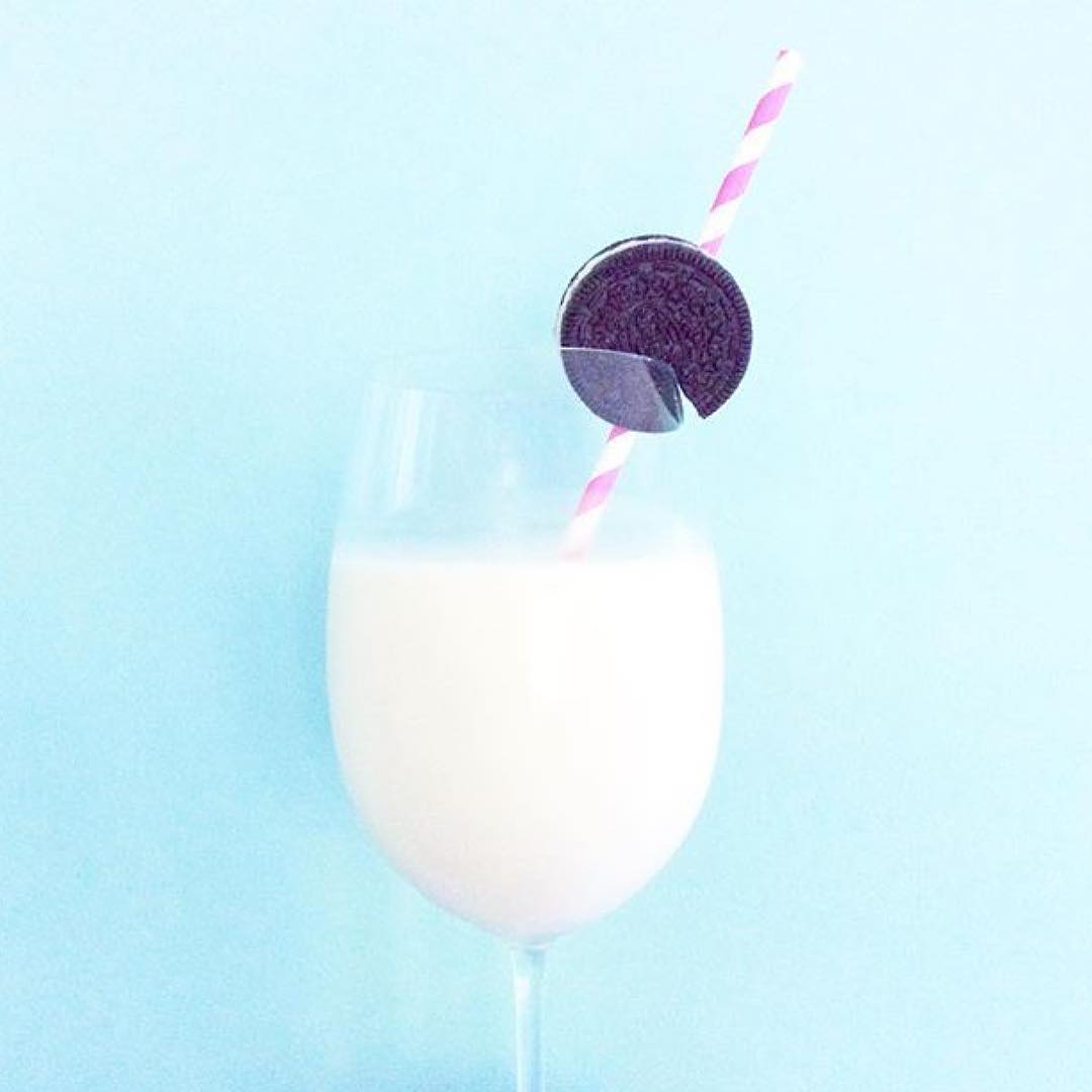
Use the Pink & Pastel Filter Packs if you take photos with colorful backgrounds.
For each photo you post on Instagram, how many photos do you actually take?
4 or 5 to every 1 I post.
Photos of me or my kids are probably 30+ because no one ever wants to look at me and smile

How far ahead do you plan your feed?
A few weeks ahead. 2 to 3 weeks.
I post in the moment too on occasion but only because I’ve been planning and curating my content for so long I know when and where I a random photo will fit.
How is Preview app helping you? And what would you say to someone who isn’t using it yet?
It’s not only helping me, but it’s helping my clients curate the feeds they’ve always wanted. It really is the best preview. It’s super easy and it’s a time saver for sure!
Favorite feature?
I think it’s great that all the Instagram analytics are in one place! I think it took the place of three separate apps I had been using previously!
Thank you Amanda for sharing all your amazing tips with us!
I had so much fun uploading your photos and preparing this blog post 🙂
You can find Amanda on Instagram and catch more visual strategy tips on her website.
Amanda is also launching a free Instagram planning and strategy challenge next week (10 July 2017). Everyone is invited to join: Join the Group!
Really nice article ! Thanks for sharing her tips with us, it’s really helpful ????
You’re so welcome! I’m really happy the tips are useful. Don’t hesitate to ask if you have any specific questions 🙂