White themes are just beautiful. There are many “sub-themes”, as I call them, within the White Theme category: you can create minimalist, monochrome, saturated elements against white backgrounds or even faded white themes.
In this article, I will tell you the 8 most important settings you need to know to make your Instagram photos white and bright.
If you love the editing process then you will love to know these tricks.
However, if you do not want to follow these steps for every single one of your pictures, then use one of the 6 unique filters we have created to make white Instagram themes. No adjustments are needed. We’ve done the hard work for you.
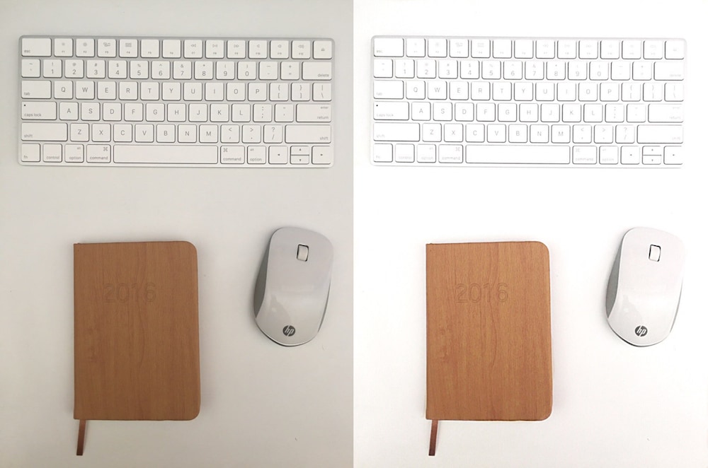
This is the photo I just took and edited.
What you need to know before doing a white theme for Instagram
- Theming is a lifestyle
Keeping a white Instagram theme can become limiting and stressful if your lifestyle does not include huge amounts of white in it. You will most of the time need to take photos against a white wall, background or table. This will ensure you keep your theme consistent. It will also make it so much easier and faster to edit your photos (less retouching with the whitening tool).
- Surround yourself with white
You will need to take your photos in front of white backgrounds: white walls, white tables, white bed sheets, white floor. You need white in your life.
- Have good lighting
Natural light is always better. If possible, shoot your photos in the morning, near a window (not in the sun) for the best natural lighting.
How to edit your photos to make them white
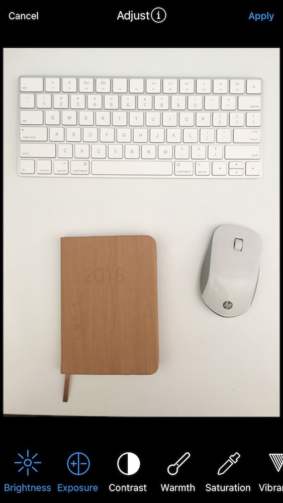
There are 8 main settings you can use to make a white theme:
- Exposure
- Brightness
- Contrast
- Highlights
- Shadows
- Saturation
- Whitening tool
- Sharpness
Adjust these settings depending on what type of “sub-theme” you want to go for.
I follow this order to make my photos white.
I start with the exposure to control the overall whiteness of the photo.
And I finish with the whitening tool in case I need to brighten the background or erase dark/yellow/grey spots on the photo.
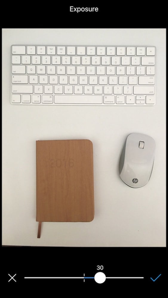
STEP 1: Exposure
- Increase for an overall brighter look.
- Depending on your photo, start with increasing between 20-30.
- Exposure moves all the tones in an image towards the brightest point.
- Adjust exposure (not the brightness) first before anything else.
- This is to make sure that the highlights in the photo look about right.
STEP 2: Brightness
- Increase brightness for a white crisp look.
- Don’t increase too much unless you want a washed out look.
- Depending on your photo, increase between 5-20.
- Brightness is mostly to change your mid-tones.
STEP 3: Contrast
- Slowly increase contrast, between 10-30.
- Highly recommended.
- Especially if you want a monochrome theme or pops of colors.
- Avoid if you want a faded look.

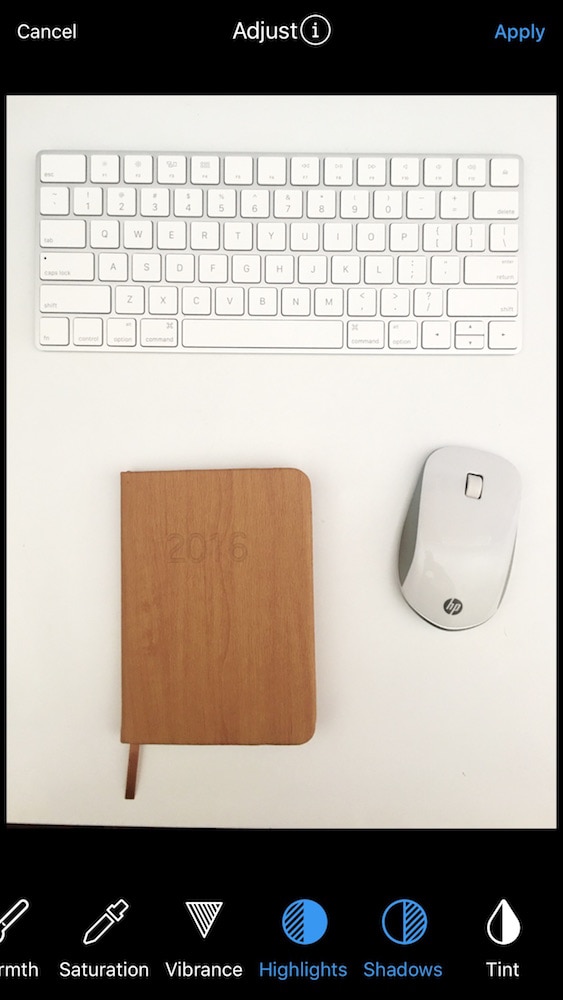
STEP 5: Highlights
- Increase to save the highlights.
- Though it will depend on the photo.
- If you increased the exposure a lot, be careful with highlights.

STEP 5: Shadows
- Decrease: so the blacks pop out more.
- Increase: to pull out detail hidden in darkness.
STEP 6: Saturation
- Decrease: if you want a monochrome look
- Increase: if you want pops of colors
As you can see below, yellow tones started to appear on the white desk when I increased saturation. So for this photo I decided not to use saturation to keep the photo white & clean.

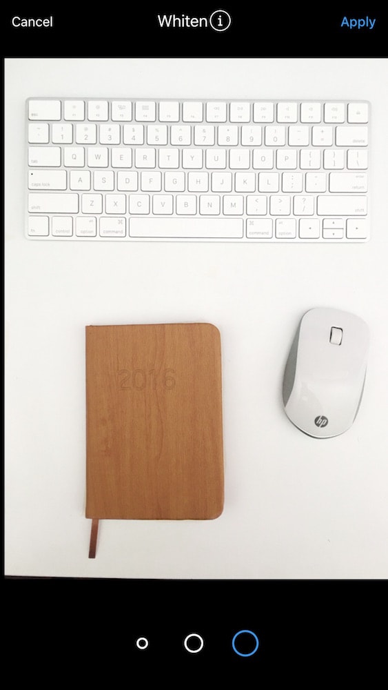
STEP 7: Whitening Tool
I usually use this tool for the last step of the editing process.
The whitening tool is totally free in the Photo Editor section of Preview.
Whitening tool is good to brighten and desaturate.
- Use the brush to make white backgrounds whiter (wall, table, floor… or your teeth if you want!)
- Zoom in and move around to be precise.
Pro Tip: If the white is not white enough after using the tool
Save the edited image
Then go back to the whitening tool to whiten it even more
Your photo will be lighter
Or increase the exposure just a little bit more
STEP 8: Sharpness
At this stage your photo should look very bright and crisp.
If you want it more crisp, use the sharpening tool.
- Increase: just a bit.
- Use this setting sparingly.
- Otherwise your photo might look fake & overedited.
I wanted my final photo to be just a little bit whiter and brighter. So I finished the look by adding 5-10 of brightness. Here is the finish look.
+400,000 Instagrammers are already using Preview App to edit, plan & schedule their feed. If you haven't tried it, you're missing out.
Great tips… I think natural light is crucial but when it’s dark here and I don’t have a photo ready I’ve relied on the whitening tool a lot..
Hey Krista! Thanks for stopping by. Yes, we need to edit more when we don’t have natural light handy. Exposure & whitening tool are the best. See you back on the gram!
how to save the photo with higher quality and can the app post on behalf of us on Instagram ?