- How can you start making a cohesive Instagram feed?
- What photos should you put next to each other to make your feed look good?
- How to order photos?
- How to color coordinate?
- What the hell should I post next?
I used to STRUGGLE big time when I was trying to design my Instagram feed.
Now I’m using 4 tricks every single time I make a theme:
- The “Rule of 9”
- 3 ways to rearrange posts
- Alternate the photos to put next to each other
- The “Rule of 3” is a theme-savior
I use Preview App to rearrange my feed. I love it because it allows you to rearrange posts using 3 different methods (and you can schedule unlimited posts for free).
I’ll show you exactly how I use the app to design my feed and to stay consistent.
Ready? Let’s go!
Feed Tip 1. Start a theme with the “Rule of 9”
You need a strong base when you start a theme.
The first thing you want to do is upload photos in your Preview App.
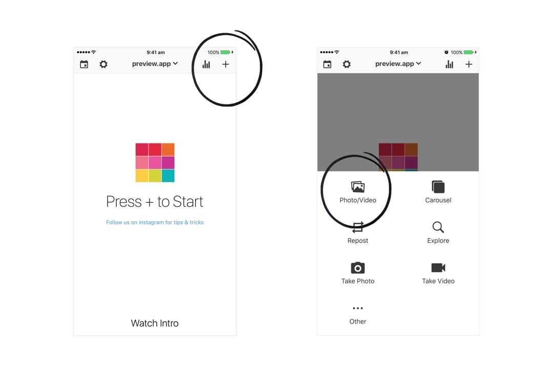
Upload 9 photos only at the beginning.
That’s my “Rule of 9”.
It will be:
- Easier to start a theme
- Easier rearrange your posts
- Easier to color coordinate your feed
- Easier to stick to a cohesive theme long term
Your 9 photos are going to be the BASE of your theme.
You will be building on top of it.
If you upload too many photos, you might get overwhelmed and won’t know where to start.
Start focusing on a small grid.
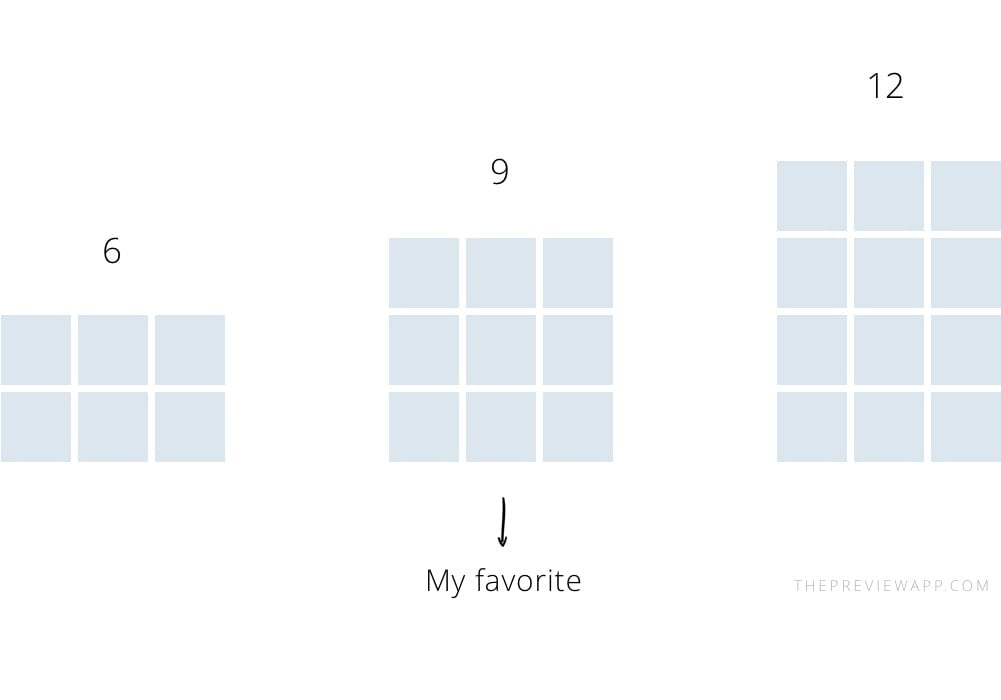
I like to focus on 9 photos at a time, but you can also upload 6 or 12 photos:
Feed Tip 2: 3 ways to rearrange your photos
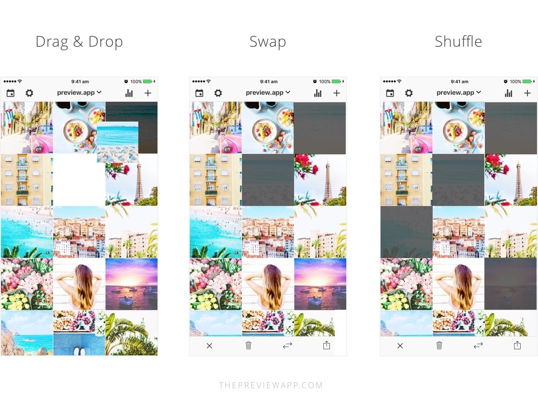
There are 3 ways you can rearrange photos in Preview:
- Drag & Drop: with your finger press and hold a photo then drag it on the other one
- Swap: select 2 photos you would like to swap and tap the swap icon on the bottom right corner of your screen
- Shuffle: select more than 2 photos and press the swap icon to rearrange them
My personal favorite is the swap feature because I like to take my time visualising where to move my posts. I use the drag and drop feature when I want to quickly rearrange posts. And I use the shuffle feature when I create specific Instagram grid layouts.
Feed Tip 3: Alternate photos when you rearrange them
Easy!
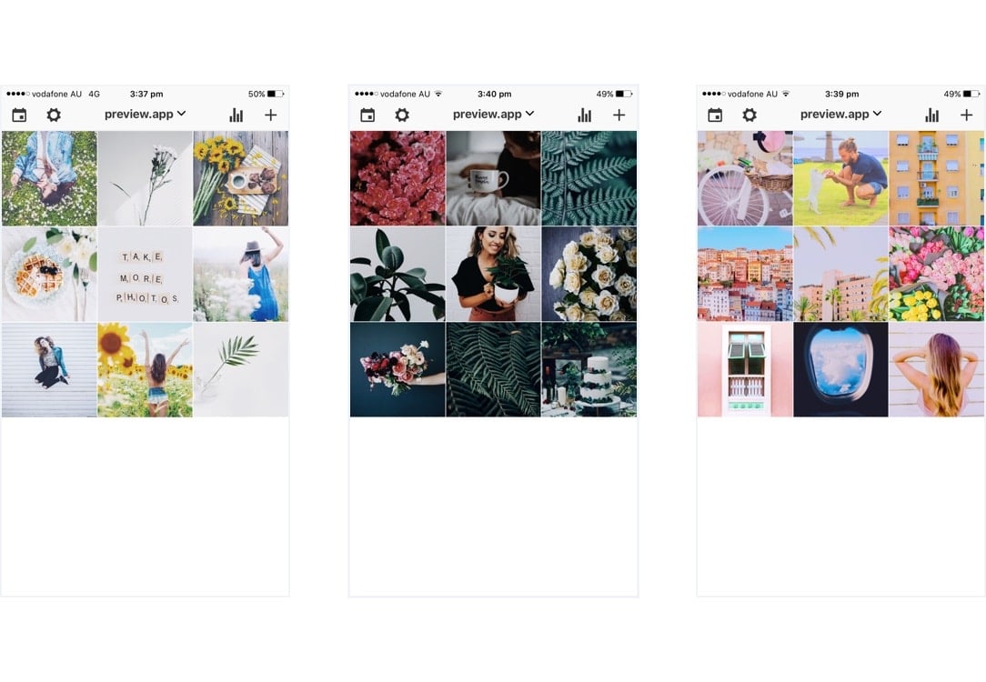
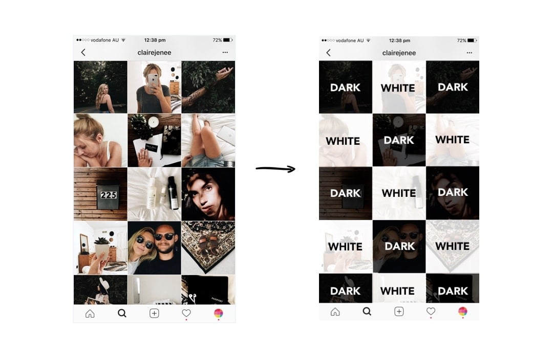
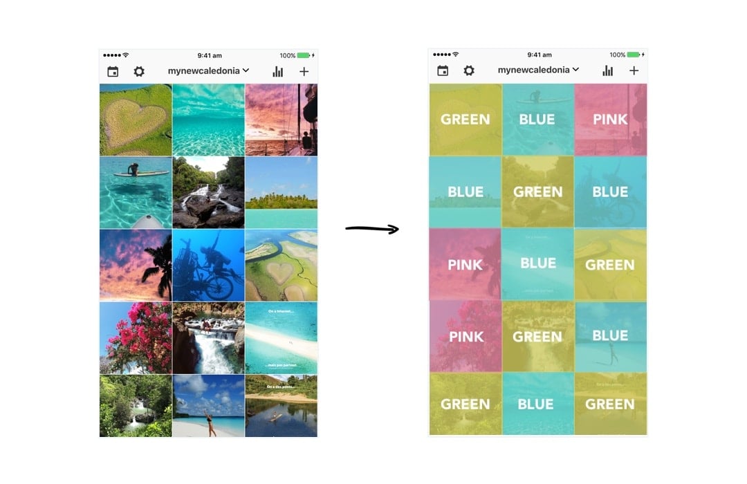
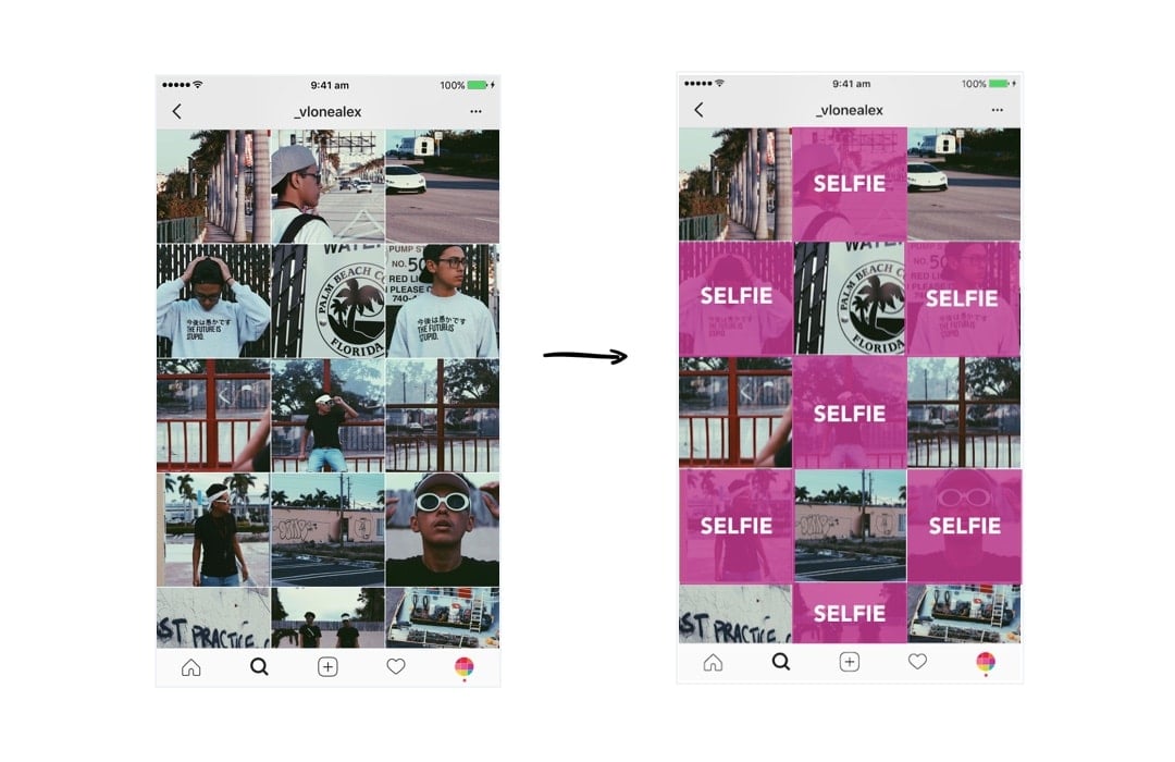
Generally, people avoid putting the same kind of photos next to each other (unless they’re posting about the same thing all the time).
The trick is to alternate your photos based on:
- What’s on the photo (the subject)
- The colors in your photos
The goal is to balance the overall look of your feed.
Here are some examples:
How do you keep your theme look consistent?
Feed Tip 4. The “Rule of 3” is a Theme Savior!
After I finish designing my grid of 9 photos, I always upload 3 photos at a time in my Preview App.
3 photos = one row = my base stays intact
Have a look to see what I mean:
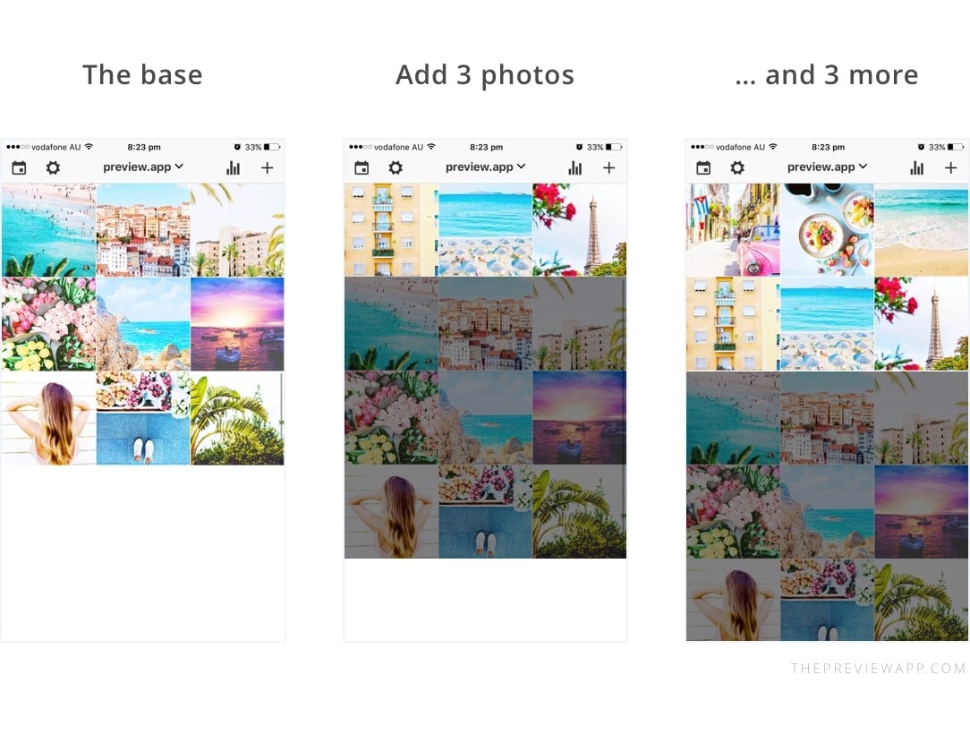
This trick makes it so much easier to visualise my overall feed, and most importantly stick to my theme. Since I have a strong base at the beginning, rearranging my photos becomes a breeze.
Every time I add more photos in Preview, this is what I automatically think about:
- The colors in the photos
- The subjects in the photos
- Space my photos out based on the colors and subjects!
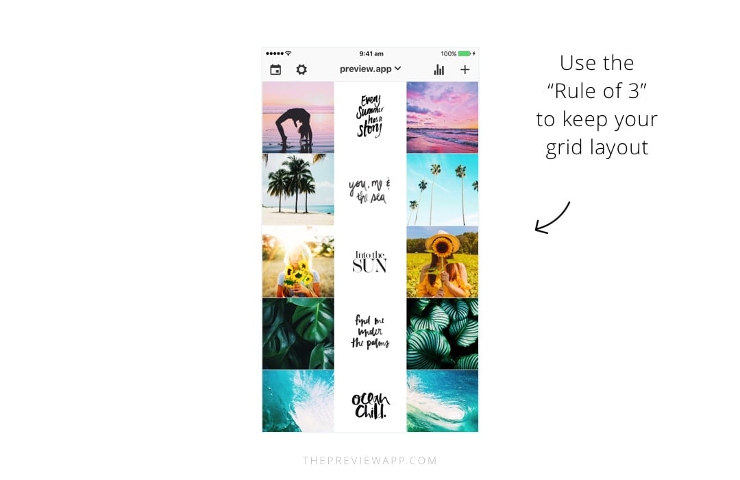
This trick is especially crucial for you if you want to maintain a specific grid layout.
For example, if you want to do a “white line in the middle” layout, you need to stick to the Rule of 3:
Done! Now you know how I rearrange my feed!
If you need more help creating a cohesive feed, I share all my tips in my step-by-step guide. You can download it below.
Have fun!
Alexandra
+400,000 Instagrammers are already using Preview App to edit, plan & schedule their feed. If you haven't tried it, you're missing out.

Hi!!! great articles, the are so helpful!!! I have a question:
If you have a theme or let’s say to make it clearer, you post a big picture that is formed by 6 posts( a big pic grid in 6 little pics-Instagram posts), when you make a new post, the whole big picture breaks as the first pic is moved one place down. Is there anyway to set specific posts so they do not move?
or in the theme as a book in one of your articles.
pic – pic – pic
quote-quote-quote
pic-pic-pic
but if I make a post now it wouldn’t look like this.
Is there anyway to avoid this so structure is always right?
THANKS!
Hello! I’m super happy you’re loving the articles! You’re completely right, as soon as you will post a new photo it will shift your whole big picture. That’s how Instagram works. There’s no way to stop them from moving.
You need to post 3 photos (after your 6 little pics grid) in order to keep the structure of your big pic.
What I usually recommend people is to post 3 photos in one day, this way when people look at your feed within the next 24 hours they will see a nicely structured feed.
I wouldn’t worry too much once your 6 little pics grid is low (at the bottom of your feed after a few weeks). People will usually look at your top 9 photos as soon as they see your account. Make sure these top 9 photos are well structured if you want to captivate their attention.
I hope this helps!
Thank you for the quick response!!!
It is a shame it is that way, but it makes sense!
However it does not really make sense to me then to do the big picture as it will be disorder very often.
I prefer to post 1 a day instead of 3 a day every 3 days so to engage people this way is worse I think.
I will keep a close eye to your articles and posts! they are very helpful! thanks!
No worries! Yep it’s doable but requires more management. See you on other blog posts 🙂
hi! what if my device is not compatible with preview app or if i cant download it is there any applications i can use instead of the preview app?
Hello! Please update to Android 5 in your phone settings. Then it will work 🙂
I have an iPhone and it freezes when I send/publish. It says success but freezes & never posts. Does it work with an iPhone? Thank you ????
Hello! I have a question about the puzzle layout. I’ve used it in my previous posts but can I delete posts from what’s under the puzzle layout and it’ll still be the same order? Cause I’ve noticed that you need to always upload 3 photos at the same time so the posts stay at the same order and not get messed up. But I’d that also true for deleting old posts? If I delete them by 3 so either 3,6,9 etc… my post will stay in order?
What do I do with my old pictures? Do you just start with the new feed photos and leave all the old ones?
How about my old photos on Instagram? Is there anyway I can move them around?
Nope… Once you post them in Instagram, they cannot be rearranged… You have 2 options:
1. Archive the pics, delete them from the feed and then repost them. If you had location, text or hashtags on the pic, by archiving them, you would save that info for later reuse.
This will give you a fresh new start and look to your feed.
2. Leave the old pics as they are and build on top of that… it’s not going to look as good as starting from scratch…
Thanks a lot for your help.
Meli
You are quite welcome! ?
I am in the process of redoing my layout myself… I’m archiving most of the 260 posts that I had for future reference… ?
How do you archive the old posts? I was charged $4.99 extra, which I assume is for this feature. Please walk me thru.
Thanks!
Hello! Please send us an email here: [email protected] . We’ll help you out!
How can I rearrange with existing post?